Things like CSS grids should remain behind the curtain. No one really needs to know how it works, or why. Until you have a broken design or something complex and you can’t figure out why your spacing, margins, paddings etc are all messed up. It can be a real pain, especially when you are generating content dynamically in some sort of interface that changes and shifts.
I’ve seen a number of people confused or irritated at how the bootstrap grid works. I’ve explained it a bunch of times, and it always makes sense afterwards. So I’d like to quickly and visually explainwhy the Bootstrap grid works, not necessarily how. Let’s check out this one weird trick about how Bootstrap does its magic.
CONTAINER
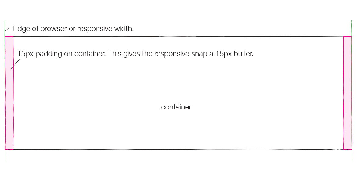
The container has 2 purposes:
- To provide the width constraints on responsive widths. When the responsive sizes change, it’s the container that changes. Rows and columns are all percentage based so they don’t need to change.
- To provide padding so the content doesn’t touch the edge of the browser. This is 15px on each side as seen in pink in the image. This is explained more later.
You never need another container inside of a container. Never. You’ll see why.

ROW
The row provides the columns a place to live, ideally having columns that add up to 12. It also acts as a wrapper since all the columns float left, additional rows don’t have overlaps when floats get weird.
Rows also have a unique aspect of having 15px of negative margin on each side, as seen in blue in the image below. The div that makes up the row would normally be constrained inside of the containers padding, touching the edges of the pink area but not beyond. The 15px negative margins push the row out over top of the containers 15px padding, essentially negating it. Why? Because of how the columns work as we’ll see next.
Never use a row outside a container, it won’t work.

COLUMN
The columns now have 15px padding, seen in yellow. This padding means that the columns actually touch the edge of the row, which itself touches the edge of the container since the row has the negative margin, and the container has the positive padding. But, the padding on the column pushes anything inside the column in to where it needs to be, and also provides the 30px gutter between columns.
Never use a column outside of a row, it won’t work.

CONTENT WITHIN A COLUMN
The column padding is what gives your content the space it needs to not touch the edge of the browser, or the content in the other columns next to it. This is where the whole container/row/column scheme finally culminates.

NESTING
When you have a container, row, and column set up, you can make new grids inside of a column. You add rows right inside the outer columns, you do not need to use them in containers:

The trick here is that the column acts the same way as a container, it has 15px of padding that allows the row’s negative 15px of margin to overlay it… which in turn lets columns inside of this new row touch the edges, but push the content in with its own 15px padding, which also creates the gutter, as seen below.

OFFSETS
Offsets are pretty simple, they just add a left margin to the side of a column to push it over. Where it gets weird is that the margin pushes off from the -15px margin on the row when on the far left, and when in the middle of a row it pushes off from the right side of the preceding column. It splits and separates the gutters. Other than that, they behave as columns would regarding how they float, push things around, etc.
Nothing really to it.

PUSH AND PULL
Let me start by saying why you push/pull: to flip layouts based on responsive sizes. Especially good for reordering how columns are laid out from a mobile design, to the desktop design, as it allows you to break the HTML top -> left drawing of divs.
These are more confusing as they actually add positioning to the columns, not margin. A push adds left positioning, and a pull adds right positioning. Since they are floated and also contained in a relatively positioned container, the row, they move to the distance you set, ie col-sm-push-4, with the positioning.

This is a problem because it can make columns just overlap and not behave like normal or like an offset. So if you push one to the right, it’s going to be on top of the one on the right, and vice versa. So almost always, when you use push/pull, you docomplementary inverses, if you push a column to the right, you’ll almost always be pulling a column to the left a complementary distance.

THE REASONING BEHIND IT
Container: The container works this way so that the edges of the container can have that virtual 15px padding around the content, but not require the body tag to have a 15px padding. This was a change in the RC1 of Bootstrap 3. Otherwise, the entire body would have a 15px padding, which would make non-bootstrap divs and such not touch the edges, which is bad for full width divs with colored backgrounds.
Rows: Rows have negative margin equal to the containers padding so that they also touch the edge of the container, the negative margin overlapping the padding. this lets the row not be pushed in by the container’s padding. Why? Well…
Columns: Columns have the 15px padding again so that they finally truly keep your content 15px away from the edge of the container/browser/viewport, and also provide the 15px + 15px gutter between columns. It is like this so that there doesn’t have to be a special first/last column that doesn’t have padding on the left/right, like in grids of old (960, blueprint, etc). Now, there is a consistent 15px space between the edges of the columns at all times, no matter what.
Nested Rows: Nested rows work just as above, only now they overlap the padding of the column they are inside, just like the container. Essentially, the column is acting as the container, which is why you never need a container inside of anything.
Nested Columns: Nothing is different here now, works the same as before.
Offsets: These essentially split gutter widths to increase the space between columns by however many column units you want. Very, very simple.
Push/Pull: These make use of positioning to trick HTML into flipping elements from left to right when going from mobile to desktop sizes. Or, for when you have a special use-case where offsets don’t work.
COMMON PROBLEMS
There are a few common problems that come up. Most of these are easily visible once you know what to look for in your HTML.
Lack of a Container: The first is the lack of a container. Not having a container means that there is no padding for the row’s negative margins to overlap, meaning now the row pushes outside of its parent element. This is the most common reason for odd column alignment or weird horizontal scrolling when you’re close to the edge of the browser, or have a container with a hidden overflow.
Lack of Rows: The next similar problem is not having a row. This goes in the opposite direction as now you have double padding on your edges, meaning now instead of the 15px between the edge of your browser/viewport, you’ll have 30px. And, your columns won’t float right and you’ll have weird float overlaps since there’s not the row there to “clear” the stacked columns.
Also, when you’re trying to nest grids, which is fine, a lack of a row will also double up the padding, so as you see below there is now 45px of padding on the left! Rows would fix this so that the nested grid was only 15px away from the edge of the browser/body as the first row overlaps the container padding, the first column touches the edge of the row, the inner row overlaps the outer columns padding, and the inner inner column touches the edge of that inner row! This is a LOT easier to see in practice, and you can see it in the nesting image up at the start of the article.

Containers Inside of Anything Else: A container inside of anything else acts like a column by adding new padding, but also adds all the responsive widths and snap points that are unique to a container. By using a container anywhere inside another container, you’re going to have problems. It is never appropriate and will just cause all sorts of havok.

Offset/Push/Pull: When using offsets and push/pulls, most of these still apply. Offsets are pretty simple as they just make columns bigger. Push/Pull is different is that if you make it too big, you can just push columns outside of their containers. Pretty easy to notice, just use common sense.

Those are some of the most common, basic grid problems. If you’re having trouble with a design with lots of nesting, or if your varying responsive layouts aren’t working how you want, go through and see if you have any of these problems first. If you fix these, often you’ll solve most of your issue that isn’t related to your custom layouts.
THAT’S IT
This is why the Bootstrap 3 grid works. It’s really clever and provides an awesome solution most of us don’t realize is taking place. After many, many years of using grid frameworks, this is the most elegant solution I’ve used so far. Even though you might look at this and think it looks convoluted, it’s really using the limitations and abilities of CSS to give us a dead-simple way to make a grid that makes sense in practice, if not entirely under scrutiny.
Be sure to check out the other Bootstrap 3 articles: The Bootstrap 3 Grid Introduction and Bootstrap 3 Less Tutorial Workflow
Fonte: http://www.helloerik.com/the-subtle-magic-behind-why-the-bootstrap-3-grid-works


