

There’s a reason responsive web design (RWD) is the bee’s knees right now. It epitomizes everything that is UX— from easy-to-use navigation, simplistic and useful design, adaptive orientation and resolution, to lightning fast loading speeds.
Using flexible grids and layouts, smart CSS and flat-out intuition, RWD responds to users’ needs in every way possible. It’s a UX design element that is incredibly broad-reaching and encompasses a variety of different types of websites among many different industries. Check out our showcase of excellent retail, music, editorial, tech, and inspiration sites.
1. More Hazards
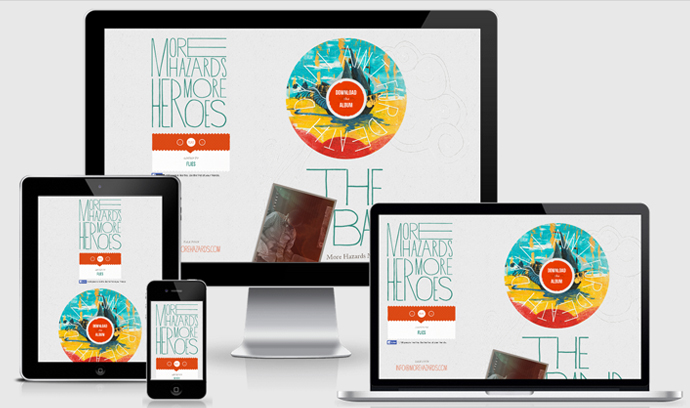
More hazards removes any anti-mobile hazards by keeping its mobile version pretty minimal. It retains functionality, but we want to know what you think about this approach. Yay or nay?
2. Bonobos
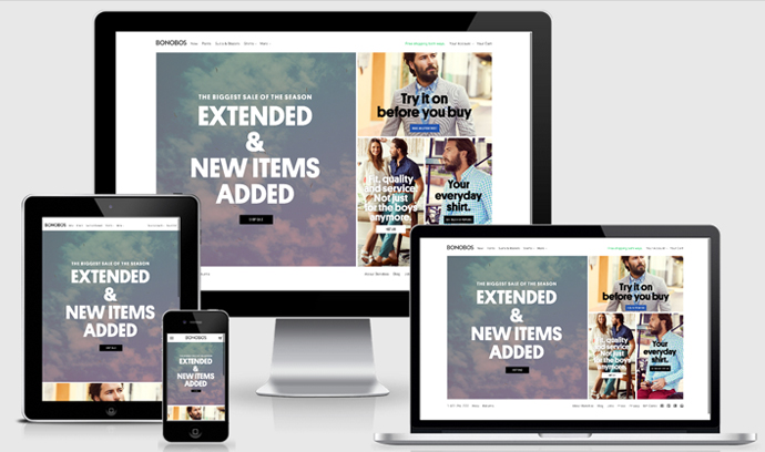
On mobile, Bonobos simplifies navigation to a simple hamburger menu icon on the left and a shopping cart on the right. The site retains the same style and detail of the original website, but with the convenience and feel of mobile.
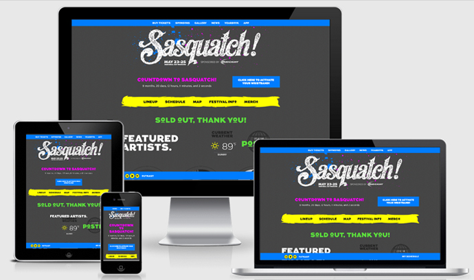
Who doesn’t love a sasquatch? But in all seriousness, this site nicely turns its lineup from a grid to a rotator using buttery-smooth CSS animations that work with swipe or touch.
4. Skinny Ties
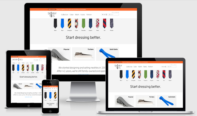
Streamlined and super fast, both the original site and the mobile site offer speed and style with its RWD… and its ties.
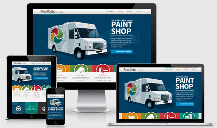
Valspar’s The Paint Drop artfully demonstrates just how well they know color. The simple scrolling site includes easy to understand icons with user-friendly large touch targets, and of course, a great color palette.
6. PACK
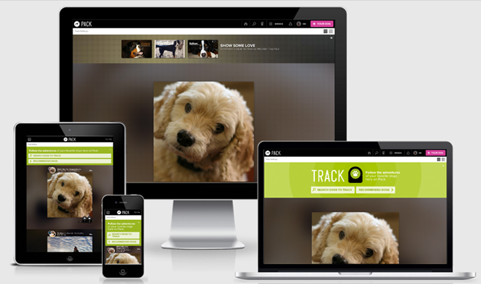
OH MAN, PUPPEHS! You can easily sniff, explore, jump and play on this site on a desktop or mobile device without feeling caged. (Oh, and by sniff, explore, jump and play, I mean navigate, sign up and scroll — You know, throw me a bone, here.)
7. MRY
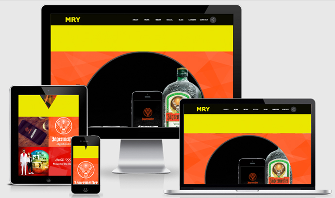
MRY is design forward with parallax scrolling, animation, and bold colors. The mobile site echoes this sentiment, but with a simple nav icon that expands, and a scroll button that glides users to its case studies.
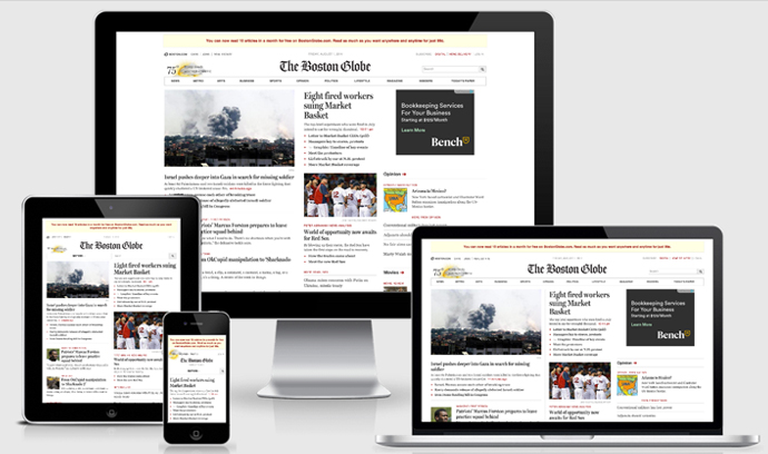
What would this list be without The Boston Globe!? A pioneer in responsive design, its cleantypography is evident throughout both views making it easy to read and use.
9. Change.org
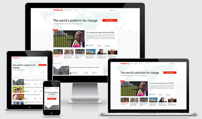
The mobile version of Change.org appropriately adjusts to the size and resolution of the mobile device making it a quintessential example of RWD.
Look! A responsive grid website in a blog post about responsive design? LOLWHUT. See what we did there? This site maintains practical usability with a simple grid, and we like it.
11. Made By Hand

Big video and big photography in a responsive site? Well done. The mobile version is just as eye catching and functional as the original.
12. Mashable
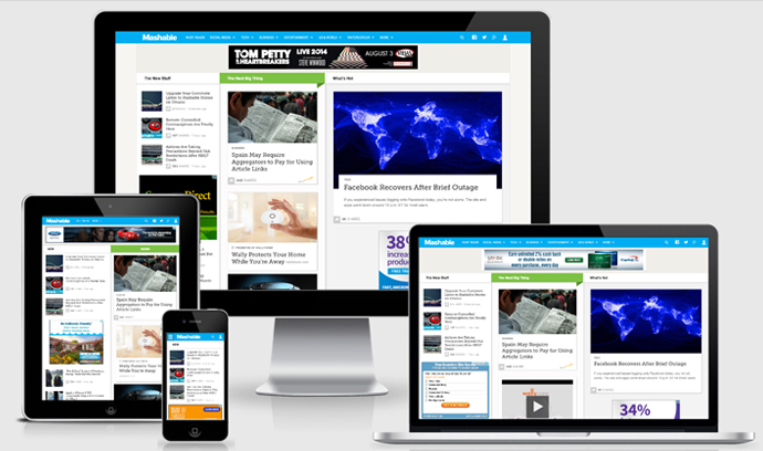
Mashable gets content to its audience quickly and efficiently with smart reading panes and smooth-moving navigation. Multiple social buttons make sharing content easy breezy.
Editor’s note: If you’re in the market for an awesome share bar, we just released Flare Pro by Filament. See it in action on our blog!
13. Starbucks
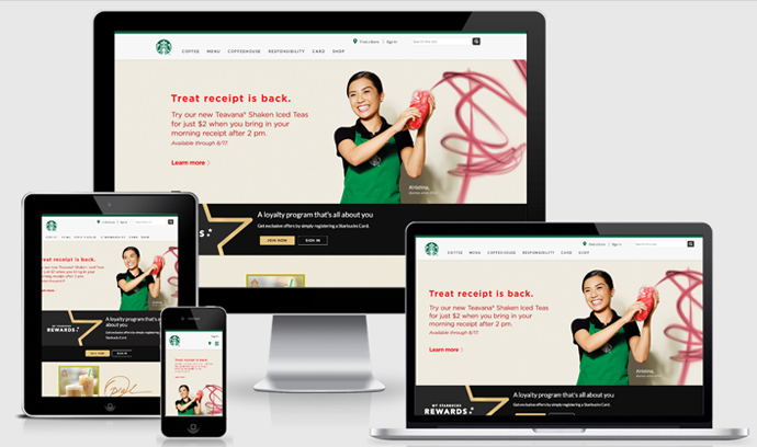
Starbucks used the traditional grid design to create a snappy, functional mobile site which includes a handy store locator. BONUS: You can even pay for your drinks with its companion app.
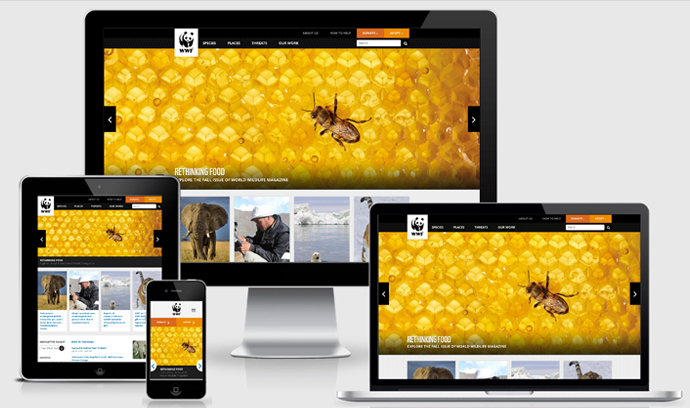
Breaking down a navigation to a mobile size isn’t as easy as swapping for a hamburger icon. World Wildlife Fund’s carries their two biggest CTAs in the nav through to every size. Also note how they treat the mobile slider functionality — a great simple solution.
That’s all, folks!
We try to be responsive to our readers and keep our lists brief (after all, we know you have other things going on), so we’ll wrap it up here. This list showcases a variety of styles of RWD that have been successfully implemented into different versions across their sites. We want to know what you think about our selection. Let us know in the comments!
Fonte: http://www.dtelepathy.com/blog/design/responsive-design-great-ux