A creative director working with some of the world’s biggest brands, Fi’s Anton Repponen presents his personal checklist for better designs.
This design checklist is a guide that I created for myself over time – it allows me to find the balance between the two extremes I face daily as a designer.
At times I can get carried away and only focus on all the little details without seeing the project from a bird’s-eye view, while at other times I only think of the project from a holistic perspective, without really focusing on the important details.
Following these 10 steps allows me to stay on track with multiple projects simultaneously, and allows for a healthier design process overall.
01. Understand the project
Before starting design work, understand what the project is really about, what function it has and what the end user should get out of it. Don’t let design overrule functionality.
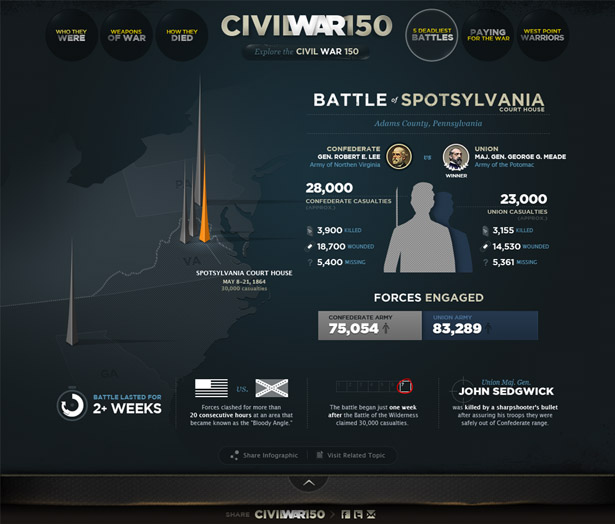
Often, designers ‘jump’ on a project not understanding and not seeing the goal. Sure, they may eventually reach that goal, but only via a much longer route: one that will involve a lot of changes. Understanding – almost imagining the final piece in your head – will let you go through a healthier process. The resulting design might surprise you.
02. Communicate your idea right
You cannot underestimate the power of presentation, both internally and in front of the client. As a designer, communicating ideas clearly and concisely eliminates a lot of questions and feedback sessions, saving time for actual work. The client will immediately feel that you have everything under control, and will trust your opinion much more.
Present your work step by step. First, show the individual components. Explain the thinking behind each one and how it works. Then show the framework of a site and the main user interactions. Make a story out of it: almost build the entire project in front of the client piece by piece. Finally, show the entire page with all components coming together.
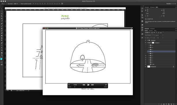
At Fi, designers rarely send JPEGs of designs to the client. Instead, we record very short videos.
At the end of the day, or before the delivery, the designer opens up their work files in Photoshop and records a 10-minute screencast talking about how everything works, turning layers on and off to show different interactions, and demonstrates how certain drop-downs will work and how the navigation will expand – all the way down to mimicking some of the transitions, creating multiple frames of components moving left and right, complete with motion blur.
03. Think about the framework
Whether you design for web, mobile or TV, think about the framework and the main user interaction first when you kick off a project. Consider how the user interacts with a device, how much space you have to design for, how the user will go from one view to another, and how the navigation will be used.
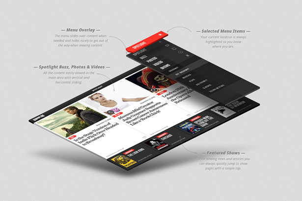
Even if you design for the web, take cues from apps: maybe your site can consist only of five templates instead of 20, and the rest of the information will appear dynamically using fly-outs, interactive drawers and so on.
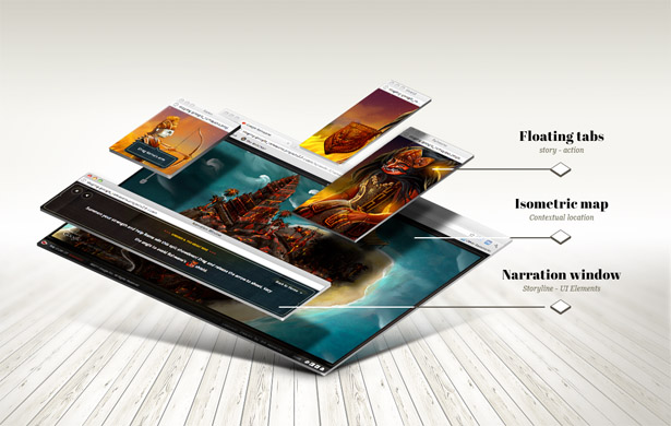
All those things are part of the design (or UX) framework. Try to innovate there first, then start designing each individual component piece by piece, knowing what the final outcome will be.
04. Keep finding work exciting
No matter how excited you are at the start of the project, it’s easy to lose your enthusiasm along the way, especially the work lasts a few months and there are constant revisions.
On projects like this, it’s important to identify areas no one is really paying attention to and innovate there, balancing this with regular work on parts of the site that require lots of attention.
If you’re bored working on the homepage, go ahead and come up with the most innovative Terms and Conditions ever designed. This may seem a silly example, but innovation is equally important as good design. Believe it or not, those innovative ideas often make their way up to ‘important’ sections of the site later, even if the client doesn’t notice them at first.
Let’s look at a real example. We’d been trying to nail down HTC homepage for quite a while. We were following all the product requirements, but it always ended up very simple. It needed that one little thing that would make it special.
At the same time, we’d been working on an interactive wizard to help people select the right HTC phone. The problem was that wizard had lots of components and was making the entire page really heavy. It distracted from the actual products.
As a solution, we created a folded paper marquee the user could drag open and find the wizard inside. That functionality – dragging/peeling the paper – was executed so smoothly that it was quickly implemented elsewhere on the site, including the homepage.
05. Work on individual pixels
Getting your idea right is only 50% of the work: the rest is pure execution. So many projects have great ideas but fail to make an impact because those ideas are implemented poorly.
Since the bar has been set so high by leading brands, most users can easily distinguish between a poorly executed design and a well-executed one. They might not spot the actual pixels that are off, but they will catch the overall look and feel.
So aim for with pixel-perfect design. Work on the smallest details, even if you think they will never be noticed. It’s these little details that will help your design stand out.
06. Question yourself
Being confident in your work is important. However, it only matters if the end result is an outstanding design. During the work process, question yourself, rethink, and question again. Are you on the right track? Is this innovative enough? Is the execution strong?
Think of it as if you were the user, or if you were your own client: would you find what you have produced new or inspiring? Questioning yourself will help you go through the design process more quickly, and will yield better results in the end.
07. Check with other departments
Designers often end up working in silos. This is limiting. Everyone around can have a valuable creative input into a project: developers, producers, and even clients. There are so many things you might not know about, and one idea can prompt another. Maybe some of the latest tech solutions can inspire you to come up with something new and interesting.
While working on UX for the BBC’s ‘Life Is‘ project, our entire team came up with ideas, with designers trying out different approaches on the go, multiple developer tests and client input. It enabled us to create a very interesting look and feel with fluid UI elements that avoid standard, safe solutions. It looks like nature designed the experience.
08. Organise your work
Working at an agency can be a collaborative process where multiple designers work on the same project. This makes it very important to keep your work organised, from having an intuitive folder structure and naming files consistently, all the way down to the way you label layers in a PSD file.
When passing your PSD to another designer, that person should not have to spend any precious time understanding what is where. Layers should be named logically, and organised from top to bottom, with the top Layer Group being the one that contains the navigation elements (if navigation is at the top of the screen), and the bottom Layer Group being the one that has all the footer items. Unused layers should be removed. This will also look more professional when a designer delivers source PSD files to the client.
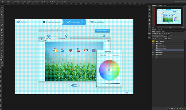
On top of that, use the grid. Be very precise with it and stay consistent. Having a grid will enable you to create templates faster and more accurately, as well as showing designers the limits of components. When you drag all the elements into the final layout, everything comes together as a puzzle. Using a grid will enable you to design more dynamic layouts in which individual components can be replaced with one other.
09. Make everything consistent
The very last step in the design process is creating a style guide based on the completed project. Essentially, a style guide is set of PSDs illustrating every little interaction: every state of every button and link, all the icons and fonts, and so on. It should contain possible case of every single component, so developers can export graphics from the file as sprites.
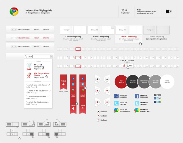
This will also enable you to see whether your project and its elements are consistent enough. Are the buttons the same height as input fields? And are you using too many assets, or could you get away with half the number?
Don’t be afraid to go into detail. Some of the style guides created for larger projects at Fi are over 100 pages in length.
10. Be proud of your work
I know so many designers who aren’t happy with their work at the end of a project. “It might have been so much cooler,” they say. “If only I’d known that this would be the final result”.
And to be honest, I’m one of them.
But it’s important to be proud of your work, and make a statement with it. This is how we came up with the case studies we do at Fi for the key projects we complete.
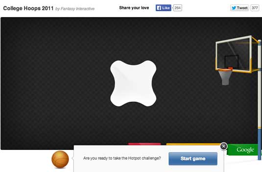
A couple of years ago we completed a nice HTML5 basketball game for Google. We struggled with it, not knowing how to showcase it properly. Small images in our portfolio wouldn’t be enough, but video wasn’t an option either: we wanted to keep it interactive.
Instead, we came up with a special promo page where we embedded the HTML5 piece, wrote up the story behind the project and highlighted design elements that were hard for users to see. In later case studies, staff started to show designs that were rejected by the client, just to show how the final piece evolved. Then we started to show the UX process that led up to the design. At some point we even began to highlight the original pitch we did for the client, to draw a full circle around the process.
Nowadays, Fi case studies are projects in their own right. They’re statements that showcase the thinking and energy we put into the work we do, all the way from idea to launch.
Hopefully, this list will help you in the same way that it has helped me. Though this approach may not suit every designer, I am sure at least a few of these points will prove relevant. If you are starting out, keep them in mind and focus on improving over time, so that one day you can create your own checklist: one that suits your own personal process.
Thank you. And stay amazing designers.
Fonte: http://www.creativebloq.com/design/anton-checklist-4146073


