As of 2014 mobile users have surpassed desktop users and according to google adwords blog published on May 2015, mobile searches have increased.
Here is what google said
“In fact, more Google searches take place on mobile devices than on computers in 10 countries including the US and Japan.”
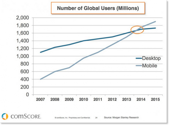
So with the increase in mobile searches, it is safe to assume that at least half of your website traffic is coming from mobile searches including tables (most tablets are categorised as mobile devices).
In fact just to prove that I am right, here is a google analytics screenshot of one of our client website for last month.
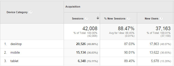
As you can see desktop searches are 20,526 and mobile plus tablet searches are 21,482, which is just edging desktop. This data might be different in another niche but it will be more or less same so now we need to cater for mobiles.
As much as we love mobile apps, not every company has a budget or resources to make a web app.
So what do we do?
We make our websites responsive or create a mobile version so we are not losing any sales.
Here are some tricks/protocols which we can use to make sure we provide the best possible mobile user experience to our customers. At the end there is a list of open source JavaScript libraries which you can use to enhance your websites for mobile.
Meta tags

Viewport
<meta name=”viewport” content=”width=device-width, initial-scale=1″>
As already discussed in web trends to follow for better seo in 2016, viewport meta tag is used to control how your website is displayed in the mobile browser.
Additional properties which can be set are
Width = can be set to an exact width i.e 320px or use device-width to match the screen size dynamically
Initial-scale = controls the zoom level when the page is loaded
maximum-scale = maximum zoom allowed in number
minimum-scale = minimum zoon allowed in number
user-scalable = set “yes” or “no” to allow user ability to zoom
target-densitydpi = device-dpi used by android to specify which page resolution the page is designed for (not really recommended as it can use “width” property and is depreciated in latest versions)
HandheldFriendly
|
1 |
<meta name="HandheldFriendly" content="true" /> |
MobileOptimized
|
1 |
<meta name="MobileOptimized" content="width" /> |
Note: If width set is less or equal to the screen width fit-to-screen will be turned off so this width will be used. If width set is larger than screen then the fit-to-screen will be on so your content fits the screen.
Keeping inactive tab active
This is an interesting trick. If you open few tabs in your mobile let’s say iphone, all the other tabs are inactive except the one you are in. So if any other website wants to tell something to user they can’t do it because they are as good as dead. But there is a way around this, use old school meta refresh
|
1 |
<meta http-equiv="refresh" content="5"> |
Content = can be set to number of seconds.
Use this script to make sure it’s not refreshed while you are on the page
|
1 2 3 4 |
<script> var metarefresh = document.queryselector("meta"); setInterval(function() { metarefresh.content= metarefresh.content; }, 1000); </script> |
Don’t really use this unless you have to because this will annoy users. You can use it in scenarios such as if they are in-active for x number of seconds then prompt them that they will be logged out.
Apple iOS specific
apple-mobile-web-app-capable
|
1 |
<meta name="apple-mobile-web-app-capable" content="yes" /> |
apple-mobile-web-app-status-bar-style
|
1 |
<meta name="apple-mobile-web-app-status-bar-style" content="black" /> |
format-detection
|
1 |
<meta name="format-detection" content="telephone=no"> |
apple-mobile-web-app-title
|
1 |
<meta name="apple-mobile-web-app-title"content="any name"> |
Windows mobile specific
|
1 2 |
<meta name="msapplication-TileColor" content="#000"/> <meta name="msapplication-TileImage" content="icon.png"/> |
To set the colour and background image if someone pins a website on windows 8 home screen.
|
1 |
<meta name="application-name" content="any name"> |
Use above meta tag to declare the icon name on windows mobile when pinning on home screen
|
1 2 |
<meta name="msapplication-badge" content="frequency=60;polling-uri=http://website.com/ badge.xml"> <meta name="msapplication-notification" content="frequency=30;polling-uri=http://website.com/ live.xml"> |
This one is interesting. Latest windows users can pin your websites to the start menu on their mobiles. Use above tags to keep the pinned website tiles updated without even users going on to your websites.
Html Protocols
Phone call
Initiate a phone call by click on link in your mobile
|
1 |
<a href="tel:00447930000000">Call us at 07930000000</a> |
Send SMS
|
1 2 |
<a href="sms:00447930000000”> <a href=”sms:00447930000000,00447930000001"> |
or pre-composed message
|
1 |
<a href="sms://+ 447930000000?body=I%20like%20this.">Send an SMS message</a> |
input type=number
As many designers know with html5 you get numeric keyboard if your input type is number but in iOS you don’t get it. The way around is to add pattern=”[0-9]*” to the input type.
|
1 |
<input type="number" pattern="[0-9]*"> |
input type=datetime
While html5 input type “datetime” works with desktop and shows calendar but to get the same functionality in mobiles use “datetime-local”
|
1 |
<input type="datetime-local"> |
This is not documented properly anywhere so normally developers use “datetime” and don’t get calendar in mobile devices.
Auto complete, auto correct and auto capitalize
|
1 |
<input type=text size=20 autocomplete=”off” autocorrect=”off” autocapitalize=”words”> |
autocorrect = auto spell check (turn it off otherwise it will annoy users as auto correct keeps changing spelling for words not in the dictionary i.e people names)
autocapitalize = capitalize first word of each word, can be set to “off”, “characters”, “sentences”
ContentEditable
Use this tag with any div, table or ul element to make it editable. When use selects the content, he will get options to edit and style the content i.e bold, italic, underline.
Use it like this
|
1 2 3 |
<div contenteditable> This is editable content </div> |
CSS
Media Queries
Use media queries to set different rules for different devices in CSS. This is very useful so as an example use this CSS
|
1 2 3 4 5 |
@media only screen and (width: 600px) { body { background-color: black; } } |
If width is exactly 600 then background is black. You can use a combination of CSS properties to set different rules for different screen sizes.
-webkit-text-size-adjust
Use -webkit-text-size-adjust: none; to prevent mobiles from automatically resizing your text.
-webkit-overflow-scrolling
The -webkit-overflow-scrolling CSS property controls whether or not touch devices use momentum-based scrolling for the given element.
|
1 2 3 |
.class{ -webkit-overflow-scrolling: auto; } |
“auto” can be used for regular scrolling when content stops as soon as your remove your finger from screen.
“touch” where content continues to scroll for a bit even after removing the finger.
-webkit-tap-highlight-color
Used in iOS, this gives the colour overlay when the user taps on a link. To disable this just set the value to ‘transparent’ or rgba(0,0,0,0) or give it any colour value.
-webkit-user-select
Prevents the user from selecting text, if set to none;
-webkit-touch-callout
Set to “none” if you don’t want user to get the toolbar which normally appears when user keep their finger on any item for a bit.
Mobile specific CSS
|
1 |
<link rel="stylesheet" href="mobile.css" type="text/css" media="handheld" /> |
iOS icons
When someone saves a website on iPhone it creates an app icon on home screen. To show your logo for the icon use these tags in head section
|
1 2 3 |
<link rel="apple-touch-icon" href="touch-icon-iphone.png" /> <link rel="apple-touch-icon" sizes="72x72" href="touch-icon-ipad.png" /> <link rel="apple-touch-icon" sizes="114x114" href="touch-icon-iphone-retina.png" /> |
Splash Screen
Splash screen is the screen which is momentarily shown while the website/app is loading. It is just like we have pre-loaders in flash websites for flash. Use below in head section to use your own image for the splash screen.
|
1 |
<link rel="apple-touch-startup-image" href="splash-screen.png" /> |
JavaScript open source libraries
Modernizr
Modernizr detects if browser is capable to run the JavaScript/html or CSS you are trying to run. So instead of relying on UA sniffing you can use modernizr.
Modernizr can easily be used with CSS by defining a “normal class” and “no normal class” so let’s say you have a CSS3 property which is not supported in old browsers, you could define it like “.class” for supporting browsers and “.no-class” for non-supporting browsers.
You can easily use it with JavaScript, so for example
|
1 2 3 4 5 |
if (Modernizr.NewFeatureAvailable) { showNewFeature(); } else { showOldFeature(); } |
Touchswipe
Touchswipe is very useful for mobiles. You can detect swipes, up, down, left and right, pinches in and out, single and double finger tap, and many more events.
jQuery mobile
As they like to call it touch-optimized web framework, most designers know about jQuery mobile.
jQuery Mobile is a HTML5-based user interface system designed to make responsive web sites and apps that are accessible on all smartphone, tablet and desktop devices.
DHTMLX Touch
DHTMLX Touch is a free open source JavaScript library for building HTML5 based mobile web apps. It’s not just a set of UI widgets, but a complete framework that allows you to create eye-catching, robust web applications that run on iOS, Android, and other mobile platforms.
Bootstrap
Bootstrap is the most popular HTML, CSS, and JS framework for developing responsive, mobile first projects on the web.
Bootstrap makes front-end web development faster and easier. It’s made for folks of all skill levels, devices of all shapes, and projects of all sizes.
Ionic
Ionic is a beautiful, open source front-end SDK for developing hybrid mobile apps with web technologies.
Free and open source, Ionic offers a library of mobile-optimized HTML, CSS and JS CSS components, gestures, and tools for building highly interactive apps.
Mobile Angular UI
Mobile Angular UI is a mobile UI framework just like jQuery Mobile.
Mobile Angular UI provides essential mobile components that are missing in Bootstrap 3: switches, overlays, sidebars, scrollable areas, absolute positioned top and bottom navbars that don’t bounce on scroll.
EmbedJs
EmbedJS is a JavaScript framework targeted at embedded devices (mobile phones, TVs, etc.).
It takes a different approach than other frameworks by shipping just the code needed for each device. That means, there’s less code going over the wire, less code branching at runtime and less memory usage.
Jo
Yes Jo is the name of a JavaScript framework. The simple open source app framework for HTML5.
Jo is for iOS, Android, Windows 8, BlackBerry 10, Tizen, Chrome OS & anything else with HTML5. Create widgets, lists and scrolling goodness using JavaScript & CSS3, make native mobile apps or web apps with the same code and it works great with PhoneGap.
Framework7
Framework7 – is a free and open source mobile HTML framework to develop hybrid mobile apps or web apps with iOS & Android native look and feel. It is also an indispensable prototyping apps tool to show working app prototype as soon as possible in case you need to.
PrimeUI
PrimeUI is a collection of rich JavaScript widgets based on jQuery UI. PrimeUI is a spin-off from the popular JavaServer Faces Component Suite, PrimeFaces.
All widgets are open source and free to use under Apache License 2.0, a commercial friendly license.
Truck
Yep this is the name of the framework. Truck helps you make mobile apps using standard web technologies. It provides layouts, widgets, touch gestures, data filtering, data binding and more.
Wakanda
Wakanda integrates the open source libraries and frameworks that you are already using such as Angular, Ionic and Cordova.
If you have any more tricks you wish to add then leave your message here and I will add those tricks as long as they belong to you with a link back to your website 😉
Fonte: Ikozmik – http://www.ikozmik.com/html-css-javascript-tricks-for-mobile-websites


