I spend a good deal of time looking at websites that have been developed using aresponsive web design (RWD). Often, many of the websites using RWD are agency sites or personal blogs, and sometimes it seems like a RWD design might only be practical for the more creative type of website. However, this is simply not true. Every type of website can benefit from using a responsive web design to allow web visitors to access the same site and content no matter what kind of device they are using. As a snapshot of an industry segment doing as much, here are 10 examples of ecommerce B2C businesses using responsive web design.
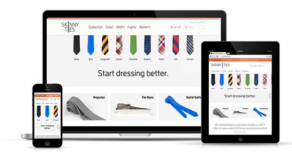
This is one of my favorite responsive retail sites because it provides a wonderful user experience whether I am on my desktop or my iPhone. Looking at this site, it is easy to tell that the designers took a “mobile first” approach to the design. The elements are all very touch friendly, and the site has a consistent look and feel no matter how you interact with it.
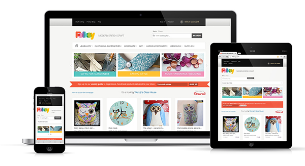
This is a site that focuses on selling crafting supplies and homemade goods. I definitely think it is a good idea for brands who sell this type of product to consider a responsive web design because so many of their customers are accessing social crafting sites like Pinterest from mobile devices. A responsive web design like this makes it easy to shepherd prospects down the sales funnel.
United Pixel Workers is a company that sells T-shirts and accessories designed by the web design community. Given its customer base is so tech savvy, it’s not surprising to find the company’s website is as well. The site uses a simple grid that scales very well to fit on smaller screens. I especially like the way the cart and menu buttons adjust at every screen size so they remain easy to find and click on.
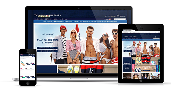
I was actually a bit surprised to find that the Tommy Hilfiger site was responsive because it seems like a lot of bigger brands seem wary of making this change. For many brands with larger websites and huge product selections, the idea of making web content responsive can be a daunting task. However, I think it is a change that must be made, and Tommy Hilfiger has done a pretty good job of making it work. This RWD website isn’t perfect, but it is easier to shop on than most other retail mobile sites I have visited.
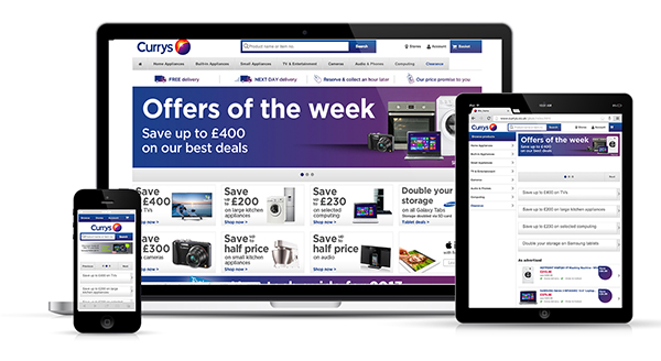
I will admit that this website for the UK electronics retailer Curry’s is anything but beautiful. I have chosen to include it in this list because I think it is important to see how an online retailor with a HUGE stock of products can make a responsive web design work effectively. What it lacks in visual appeal it makes up for in usability. Everything on this site is organized and has a purpose. I also like the large navigation buttons that are good for touch and in your face, and the search function which makes searching for particular products a breeze. This site certainly fulfills it’s duty to make purchases simple for customers on any device.
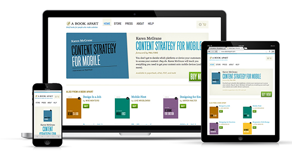
This retail site is the go-to place for educational resources about web design. It is no surprise that the company responsible for publishing one of the first books about responsive web design is utilizing the technology. The A Book Apart storefront layout looks good on every device size and never appears cluttered or crowded.
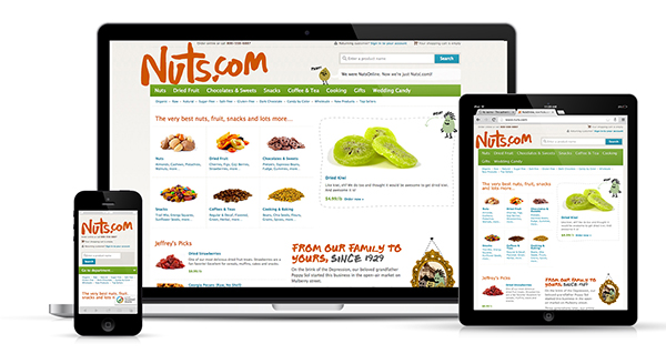
Just another specialty retailor that seems to be well ahead of the bigger brands. Again, this isn’t the most beautiful responsive website, but it is still successful. The navigation system here is easy to follow, and shopping on smaller devices is a simple, painless process.
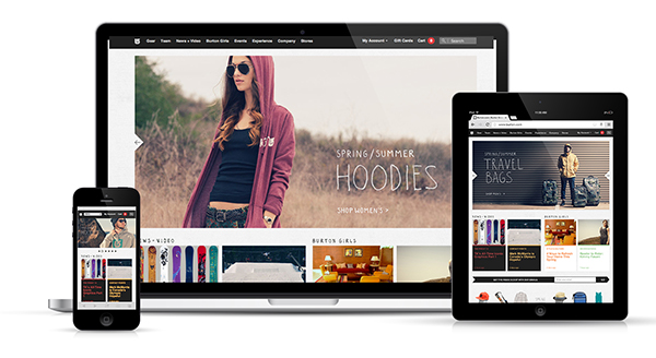
I believe snowboard retailer Burton definitely knows its customers are shopping this website from their phones and tablets. The company has made a smart choice in choosing to adopt a responsive web design that gives users the same experience no matter how they choose to shop. I do wish the navigation was a bit easier to click on the mobile screen size, but I like the way they have used images and a simple grid to make the design conform to any screen size.
Cocosa is a members-only retail shopping site. You know, one of those websites where you get daily email updates about new and upcoming sales? As someone who is a member of a bunch of them, I can tell you first hand how annoying it is to click on a link in an email and then be sent to a mobile version of the website asking me to download the app. It’s like the catch-22 of mobile shopping. Cocosa solves all that by simply having a responsive website. Click an email link and be sent directly to the RWD website to enjoy the mobile shopping process.
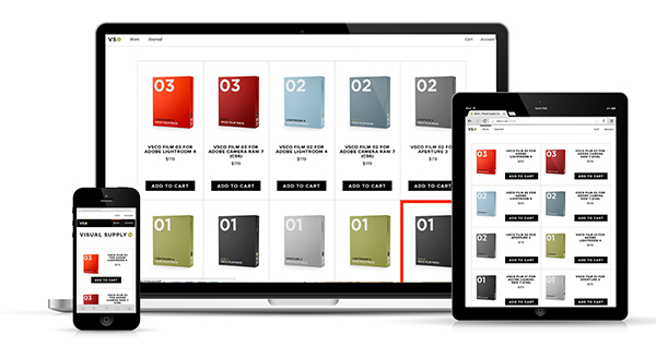
Visual Supply Co. has a very simple, straightforward storefront selling photo-editing software. I like that this store has such clean lines, and I appreciate that everything is easy to click on when I access it from my mobile device. Big buttons are essential for touch, especially that big “Buy Now” or “Add to Cart” button!
A responsive web design is the best method to ensure that your website is useable on nearly every device. This is especially important for ecommerce websites, because you never know how and when your customer will try and make a purchase. From fashion to food to educational resources, a responsive web design is a great way for any online retailer to reach customers anywhere, anytime.
Fonte: http://engage.synecoretech.com/marketing-technology-for-growth/bid/177023/10-Awesome-Examples-of-Ecommerce-Sites-Using-Responsive-Web-Design


