Baby steps
It’s super easy to put together a basic page with Bootstrap.
Just fire up your editor and type in this markup:
|
1 2 3 4 5 6 7 8 9 10 11 12 |
<!DOCTYPE html> <html> <head> <title>Bootstrap in practice: the grid system</title> <meta name="viewport" content="width=device-width, initial-scale=1.0" /> <!-- Bootstrap CSS --> <link href="//netdna.bootstrapcdn.com/bootstrap/3.0.0/css/bootstrap.min.css" rel="stylesheet" /> </head> <body> <h1>Hello, world!</h1> </body> </html> |
This is it. There are just two requirements for a basic Bootstrap page:
- HTML5: achieved declaring a
<!DOCTYPE html> - Bootstrap CSS
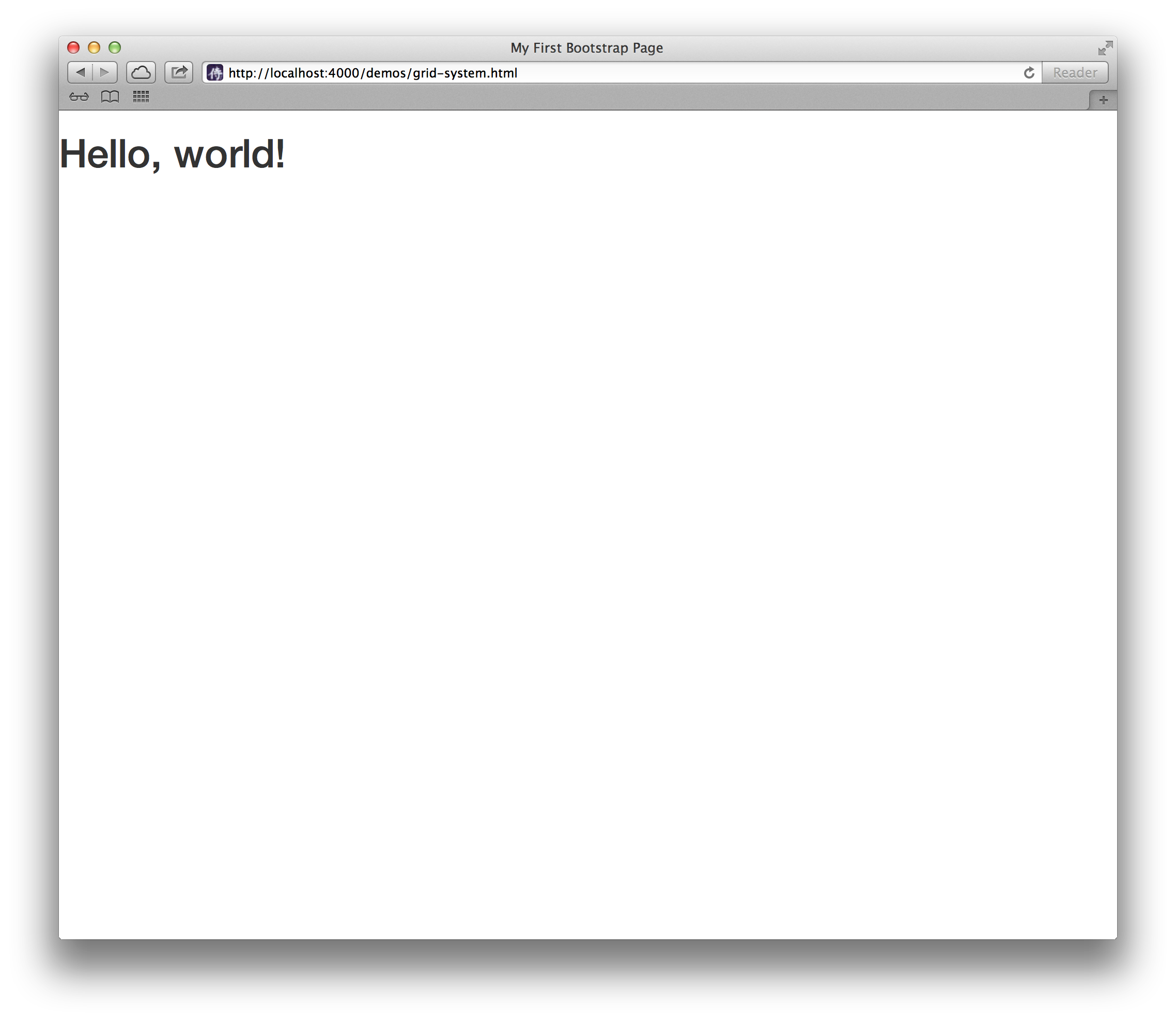
Take a look at the page in a browser, and you’ll see a lonely — but stylish — Hello, world!.
Heads up! You’d better serve these pages locally.
If you have ruby, your best bet is to gem install serve and then launch serve . from the directory where your HTML file resides.
Then point your browser to http://localhost:4000/ and you are golden.
If you can’t or don’t want to serve your pages locally, then please change every protocol relative URL in the sources to its more classic variant, or your browser may not be able to find those resources.
Example: change //netdna.bootstrapcdn.com/bootstrap/3.0.0/css/bootstrap.min.css tohttp://netdna.bootstrapcdn.com/bootstrap/3.0.0/css/bootstrap.min.css.
Adding some beef
You are going to see the grid system in action very soon, but first you need to beef up your page with some random content.
I’ll take mine from hipsteripsum.me, but the classic www.lipsum.com or any editor plugin will be fine as well.
|
1 2 3 4 5 6 7 8 9 10 11 12 13 14 15 16 17 18 19 20 21 |
<!DOCTYPE html> <html> <head> <title>Bootstrap in practice: the grid system</title> <meta name="viewport" content="width=device-width, initial-scale=1.0" /> <!-- Bootstrap CSS --> <link href="//netdna.bootstrapcdn.com/bootstrap/3.0.0/css/bootstrap.min.css" rel="stylesheet" /> </head> <body> <h1>Hello, world!</h1> <p>Asymmetrical YOLO banjo lomo fanny pack, shoreditch flexitarian dreamcatcher ethnic kitsch sriracha nisi sustainable swag. Cliche 90's farm-to-table master cleanse Pinterest jean shorts. Cillum raw denim aesthetic sunt.</p> <p>Aliqua photo booth literally veniam minim leggings, est craft beer banjo intelligentsia Truffaut officia. Irony minim 3 wolf moon meggings, viral hella hoodie selvage flexitarian small batch pariatur.</p> <p>Consectetur art party Tonx culpa semiotics. Pinterest assumenda minim organic quis.</p> <p>Wayfarers selvage YOLO, commodo assumenda eu est bespoke mlkshk. Helvetica reprehenderit iPhone, aesthetic 90's literally chambray bicycle rights viral blog voluptate. Occupy bespoke stumptown duis keytar vero.</p> </body> </html> |
Here comes the grid
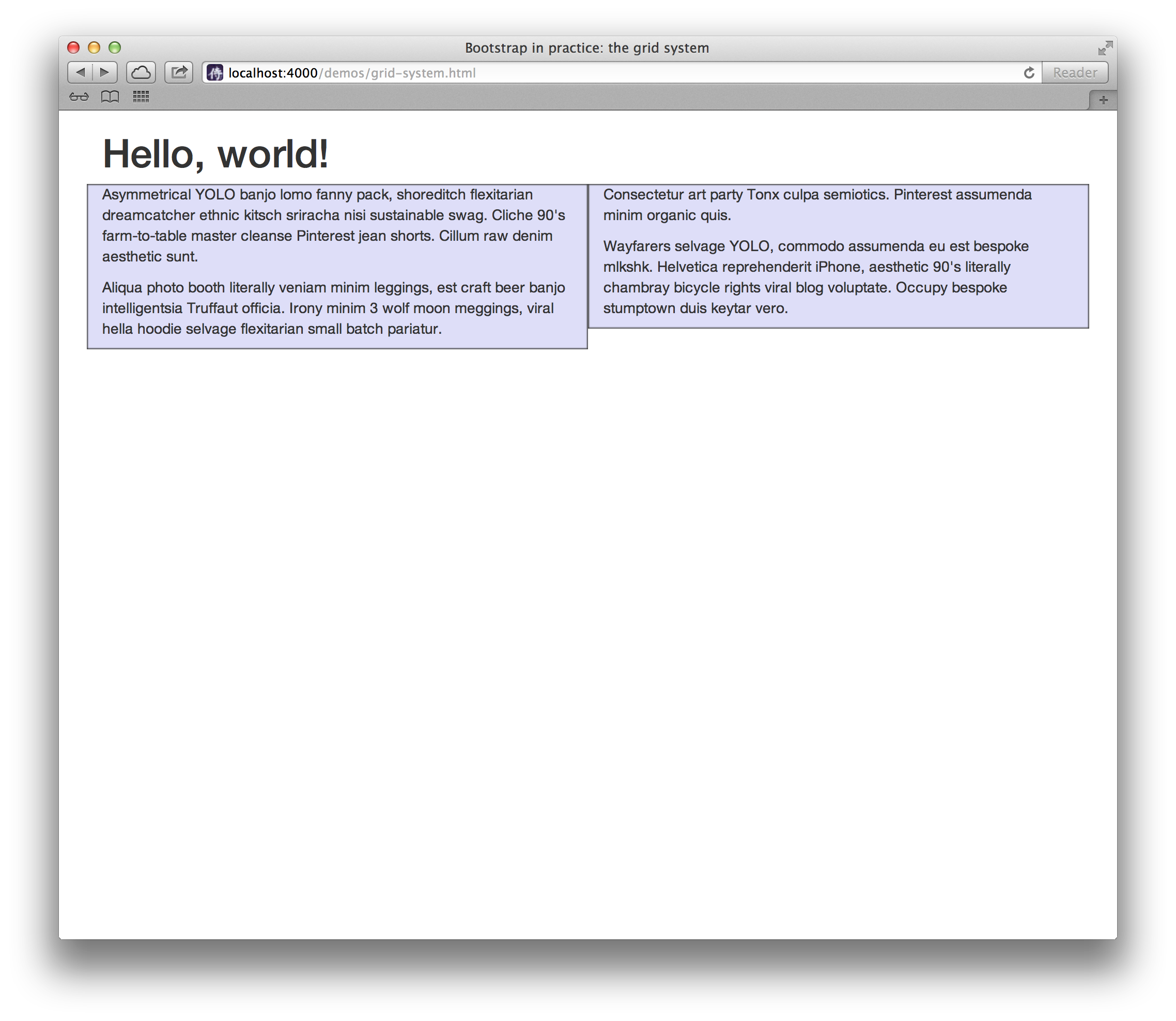
Let’s start with a very simple layout: two columns, two paragraphs per column.
|
1 2 3 4 5 6 7 8 9 10 11 12 13 14 15 16 17 18 19 20 21 22 23 24 25 26 27 28 29 30 31 32 33 34 35 36 37 38 39 40 41 |
<!DOCTYPE html> <html> <head> <title>Bootstrap in practice: the grid system</title> <meta name="viewport" content="width=device-width, initial-scale=1.0" /> <!-- Bootstrap CSS --> <link href="//netdna.bootstrapcdn.com/bootstrap/3.0.0/css/bootstrap.min.css" rel="stylesheet" /> <!-- To better visualize the columns --> <style> .row > div { background-color: #dedef8; box-shadow: inset 1px -1px 1px #444, inset -1px 1px 1px #444; } </style> </head> <body> <div class="container"> <h1>Hello, world!</h1> <div class="row"> <div class="col-md-6"> <p>Asymmetrical YOLO banjo lomo fanny pack, shoreditch flexitarian dreamcatcher ethnic kitsch sriracha nisi sustainable swag. Cliche 90's farm-to-table master cleanse Pinterest jean shorts. Cillum raw denim aesthetic sunt.</p> <p>Aliqua photo booth literally veniam minim leggings, est craft beer banjo intelligentsia Truffaut officia. Irony minim 3 wolf moon meggings, viral hella hoodie selvage flexitarian small batch pariatur.</p> </div> <div class="col-md-6"> <p>Consectetur art party Tonx culpa semiotics. Pinterest assumenda minim organic quis.</p> <p>Wayfarers selvage YOLO, commodo assumenda eu est bespoke mlkshk. Helvetica reprehenderit iPhone, aesthetic 90's literally chambray bicycle rights viral blog voluptate. Occupy bespoke stumptown duis keytar vero.</p> </div> </div> </div> </body> </html> |
The details
First of all, we added a <div class="container">...</div> container element to ensure proper centering and maximum width for the layout. That’s your playground.
Once you have a container in place, you just have to start thinking in terms of rows <div class="row">...</div>, and columns inside the rows <div class="col-md-6">...</div>.
Keep in mind that every row in the grid is made up of 12 units, and you can define the desired size of your columns using those units.
In the previous example you had two columns, each being 6 units wide: col-md-6.
As you know, 6 + 6 = 12, and that’s exactly why you had two equally large columns (col-md-6) in a row taking the whole width (12) of the container element.
Go on, try some more combinations like <div class="col-md-3">...</div> <div class="col-md-9">...</div> or<div class="col-md-7">...</div> <div class="col-md-5">...</div> and take a look at the results in your browser.
Experiment a bit. Just keep in mind that the sum must always be 12.
If you’re feeling brave you could also have more than two columns in the same row, adjusting the column classes accordingly.
Hint: 3 + 3 + 1 + 5 = 12.
As you may have guessed, if you need to add another row below the first one, you can. Add as much rows as you want.
Nesting
Need to nest a row into another? Bootstrap 3 has you covered.
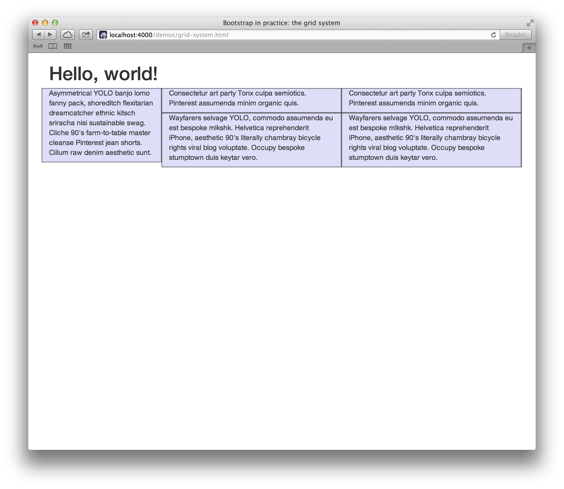
Let’s see this in action by producing a layout having two columns, with the second one being splitted into four boxes over two rows.
|
1 2 3 4 5 6 7 8 9 10 11 12 13 14 15 16 17 18 19 20 21 22 23 24 25 26 27 28 29 30 31 32 33 34 35 36 37 38 39 40 41 42 43 44 45 46 47 48 49 50 51 52 53 54 55 |
<!DOCTYPE html> <html> <head> <title>Bootstrap in practice: the grid system</title> <meta name="viewport" content="width=device-width, initial-scale=1.0" /> <!-- Bootstrap CSS --> <link href="//netdna.bootstrapcdn.com/bootstrap/3.0.0/css/bootstrap.min.css" rel="stylesheet" /> <!-- To better visualize the columns --> <style> .row > div { background-color: #dedef8; box-shadow: inset 1px -1px 1px #444, inset -1px 1px 1px #444; } </style> </head> <body> <div class="container"> <h1>Hello, world!</h1> <div class="row"> <div class="col-md-3"> <p>Asymmetrical YOLO banjo lomo fanny pack, shoreditch flexitarian dreamcatcher ethnic kitsch sriracha nisi sustainable swag. Cliche 90's farm-to-table master cleanse Pinterest jean shorts. Cillum raw denim aesthetic sunt.</p> </div> <div class="col-md-9"> <div class="row"> <div class="col-md-6"> <p>Consectetur art party Tonx culpa semiotics. Pinterest assumenda minim organic quis.</p> </div> <div class="col-md-6"> <p>Consectetur art party Tonx culpa semiotics. Pinterest assumenda minim organic quis.</p> </div> </div> <div class="row"> <div class="col-md-6"> <p>Wayfarers selvage YOLO, commodo assumenda eu est bespoke mlkshk. Helvetica reprehenderit iPhone, aesthetic 90's literally chambray bicycle rights viral blog voluptate. Occupy bespoke stumptown duis keytar vero.</p> </div> <div class="col-md-6"> <p>Wayfarers selvage YOLO, commodo assumenda eu est bespoke mlkshk. Helvetica reprehenderit iPhone, aesthetic 90's literally chambray bicycle rights viral blog voluptate. Occupy bespoke stumptown duis keytar vero.</p> </div> </div> </div> </div> </div> </body> </html> |
Offsetting
You can also move columns to the right using .col-md-offset-N where N, ranging from 1 to 11, is the number of units you want the column to be moved.
Offsetting comes in handy when you need to center an element.
Say you have a <div class="col-md-6">...</div>.
Centering it, is as easy as adding .col-md-offset-3:
|
1 2 3 4 5 6 7 8 9 10 11 12 13 14 15 16 17 18 19 20 21 22 23 24 25 26 27 28 29 30 |
<!DOCTYPE html> <html> <head> <title>Bootstrap in practice: the grid system</title> <meta name="viewport" content="width=device-width, initial-scale=1.0" /> <!-- Bootstrap CSS --> <link href="//netdna.bootstrapcdn.com/bootstrap/3.0.0/css/bootstrap.min.css" rel="stylesheet" /> <!-- To better visualize the columns --> <style> .row > div { background-color: #dedef8; box-shadow: inset 1px -1px 1px #444, inset -1px 1px 1px #444; } </style> </head> <body> <div class="container"> <h1>Hello, world!</h1> <div class="row"> <div class="col-md-6 col-md-offset-3"> <strong>Hey oh! See how I'm centered!</strong> </div> </div> </div> </body> </html> |
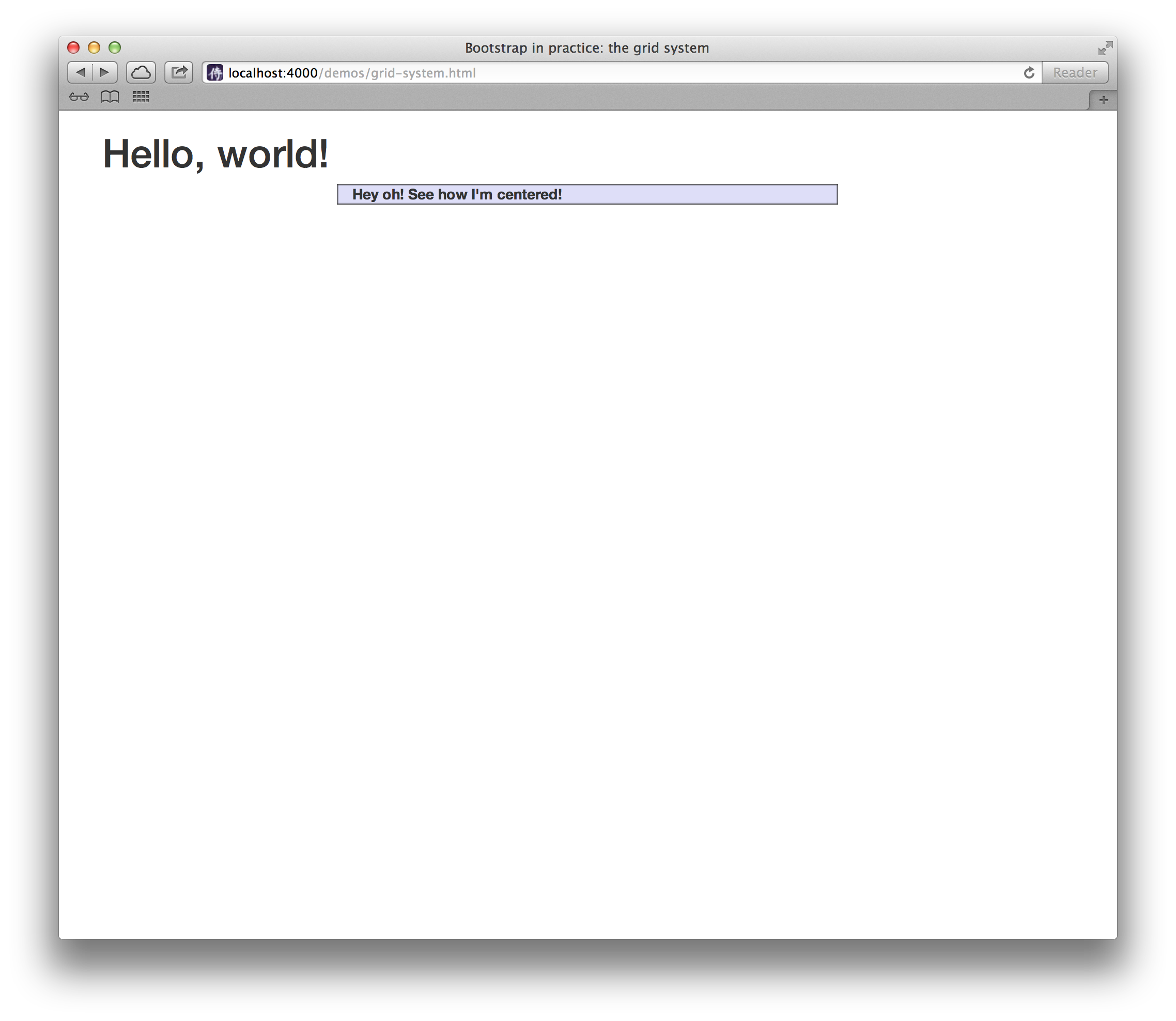
That’s because you have a total width of 12 units, and a 6 units wide element you want to center. Thus, you split the remaining 6 units in two, and here’s your offset for centering the element. 3 + 6 + 3 = 12.
Ordering
Another nice feature of the grid system is that you can easily write the columns in an order, and show them in another one.
So if you have a two-columns layout with the left column being the narrowest and acting as a sidebar:
|
1 2 3 4 |
<div class="row"> <div class="col-md-4">...</div> <div class="col-md-8">...</div> </div> |
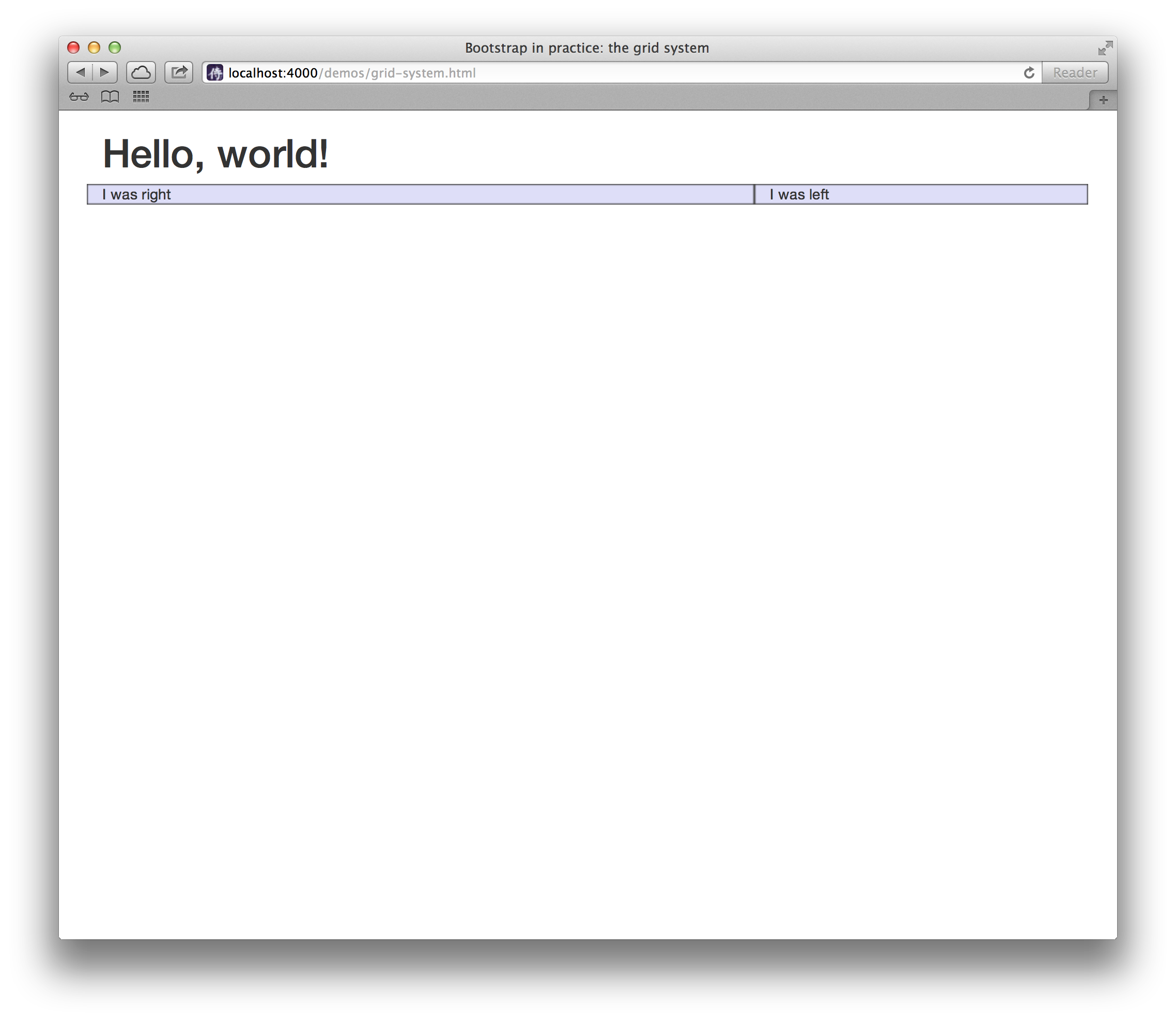
You can swap the order of the columns using .col-md-push-N and .col-md-pull-N.
Once again, N is a number from 1 to 11:
|
1 2 3 4 5 6 7 8 9 10 11 12 13 14 15 16 17 18 19 20 21 22 23 24 25 26 27 28 29 |
<!DOCTYPE html> <html> <head> <title>Bootstrap in practice: the grid system</title> <meta name="viewport" content="width=device-width, initial-scale=1.0" /> <!-- Bootstrap CSS --> <link href="//netdna.bootstrapcdn.com/bootstrap/3.0.0/css/bootstrap.min.css" rel="stylesheet" /> <!-- To better visualize the columns --> <style> .row > div { background-color: #dedef8; box-shadow: inset 1px -1px 1px #444, inset -1px 1px 1px #444; } </style> </head> <body> <div class="container"> <h1>Hello, world!</h1> <div class="row"> <div class="col-md-4 col-md-push-8">I was left</div> <div class="col-md-8 col-md-pull-4">I was right</div> </div> </div> </body> </html> |
