Years ago, the online world progressed from simple HTML Web 1.0 websites to Web 2.0 websites, which included enhancements like JavaScript and CSS. Today is the era of the “responsive website,” which means e-commerce sites should respond to a visitor’s environment and needs with only minor adjustments and without glitches.
A “responsive” website is easy to identify; it has a few key features that make it stand out. These include the following:
A. It’s fast, vibrant, tidy, and easy to navigate
B. It adjusts its size to the visitor’s device, whether it is an iPhone, a Blackberry, or an iPad
C. It requires minimal scrolling and minimizing/maximizing, and does not require users to navigate through a lot of page
If you’ve come across a website with the features listed above, rest assured that it is a responsive website.
Below are some examples of the best responsive e-commerce websites we’ve come across on the Internet. However, before we proceed, let us explain why we emphasize e-commerce.
E-commerce has taken the Internet by storm. Most brick and mortar stores now have an online presence, and people are responding well to this convenience. We’ve emphasized this particular type of website because they tend to require the most amount of activity on the part the visitor. Hence, the sites must be highly responsive.
The Most Responsive Websites
The following are the most responsive sites we encountered. The cart and mobile experience of these sites are usually exceptional.
1) KingArthurflour.com
This website averages an estimated 1,150,000 visitors per month. It sports a clean, vibrant design and is easy to navigate, even on mobile devices. The navigation column lists all sub-pages in a horizontal form so visitors need not scroll down, as they normally must.
2) Hickoryfarms.com
What sets this website apart is that it lets its visitors shop in the manner they desire. You can shop by category or price, which is a great responsive feature. The website is beautifully designed in CSS. The Cart experience is smooth, and website navigation is intuitive and efficient.
3) Explore.ee.co.uk
EE is a 2/3/4G network service provider. Normal things aside (browsing, cart, etc., which are quite responsive) this website features a distributor locator and a coverage checker in the top header. This is quite unusual, and makes it an ideal network provider website.
4) Karma Loop
What is most impressive about this website is that the cart and checkout run on every page, starting with the front page. Instead of having to go to the cart to checkout, you can press an instant button and do the deed. Fast, smooth, and easy navigation, in addition to good mobile responsiveness, make Karma Loop very responsive, in our opinion.
5) Tsubo
Tsubo deals in a range of footwear for both men and women. Sporting a clean and minimalistic design, the site provides a chat feature as an embedded option on every page, rather than on a specific page. You can use the chat feature even while viewing the website on mobile.
6) Garmin
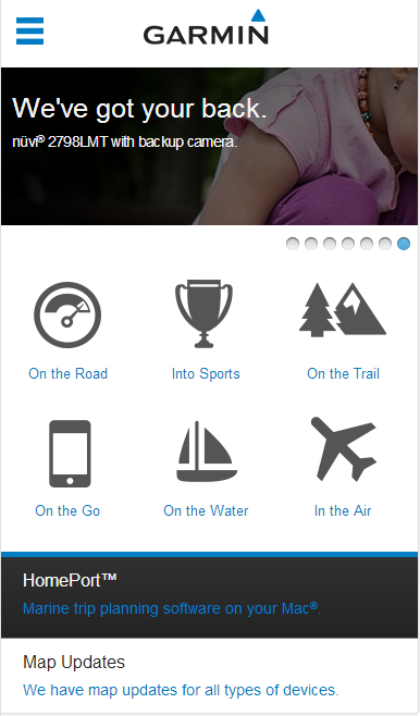
Garmin’s website, which sells consumer, marine and aviation technology devices and maps, features a sharp, chic design. It is very responsive; navigation is quick and easy. The front page is catchy, and the “Maps” feature (which lets you explore the site’s map collection) is quite responsive, even when viewed on mobile devices.
7) Fredericks.com
Fredericks.com features scintillating CSS and Javascript usage to create a neat-looking, responsive website with colors that are easy on the eyes. A store locator, login in/out button and cart are available as buttons in the header. The home page comprises sale offers from almost all sections, which it advertises in the top navigation column.
Particularly impressive is the store locator, which can track down any store within a specified distance of the ZIP code you enter. The shopping and mobile experience is very smooth.
8) CpoOutlets.com
What is particularly impressive about this site is the responsive navigation column, which is clean and sharp, and sports a barrage of options with illustrative images next to each option. Navigation through the rest of the website is also impressively fast and smooth.
9) Magazines.com
Magazines.com is a perfect example of a well-organized magazine website (which is an inherently complex undertaking). The top navigation column lists all categories and highlights important categories. The front page shows a list of magazines that customers can add directly to the cart. Users can also view their subscriptions on the front page.
10) TheGrommet.com
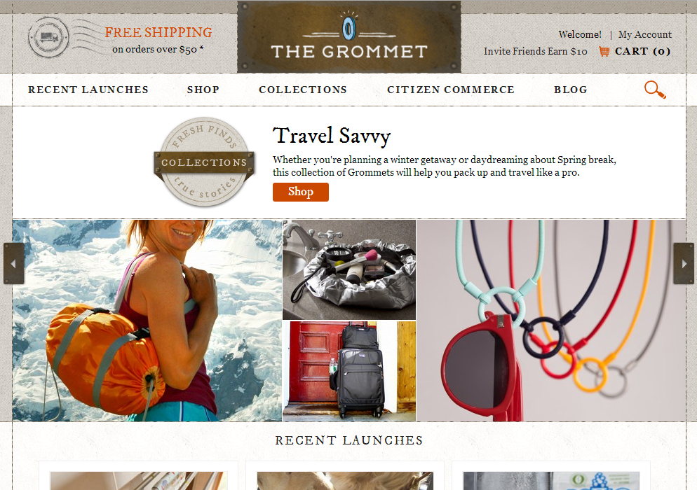
This is one of the more responsive websites on the list. It offers almost any kind of product one can think of, and lets people post products for sale, as well. The page on which it posts products shows very sharp pictures of products and their sellers. Navigation is fast, and does not require much scrolling or resizing, even when viewed on mobile. Another cool responsive feature is the pop-out instructions or details that appear when users hover over certain buttons.
11) Godiva.com
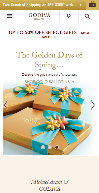
Godiva.com sells assorted chocolates online. With a unique boutique locator in its header, and with the cart option and beautiful pictures of chocolates in high definition, it nevertheless offers smooth, fast, easy scrolling. This website is highly responsive.
12) DiscountFilters.com
DiscountFilters.com markets various types of Air and Water filters. Right on the front-page banner is a quick search tool that lets users search for the filter of their choice, which earns the website extra responsiveness points. Navigation is quick and smooth, and the shopping cart experience is seamless.
13) Pfaelzer-brothers.com
What stands out about this website is its beautifully illustrated product pictures, and the responsive feature that lets visitors shop for various cuts of meat. The navigation is flawless, and the cart experience is quick and secure.
14) American Musical Supply
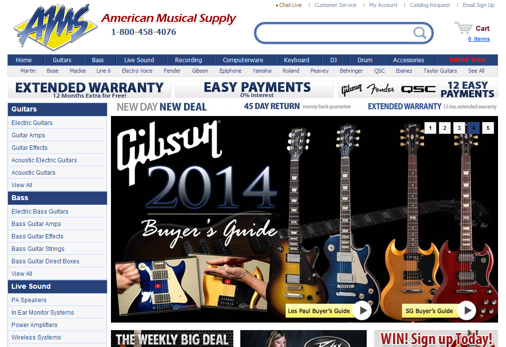
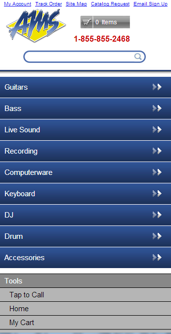
Featuring one of the most responsive mobile designs we’ve seen, AMS’s website sells music products online. It previews many of its products with a side-bar for easy navigation. On mobile view, these tabs are clubbed into buttons for a buttery smooth view. Very responsive.
15) Joann.com
This website sells fabrics online. Beautifully designed in CSS, navigation is easy and extremely fast. The front page comprises various pictures of products, which users can be add straight to their cart. Overall, it is a very responsive website.
16) Threadless.com
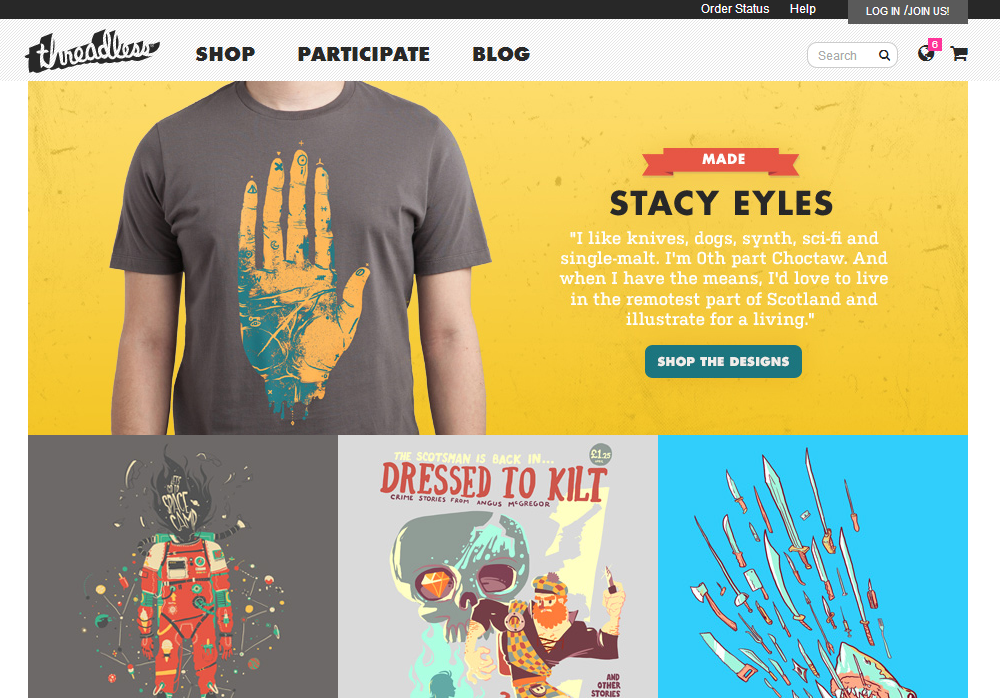
Online apparel store Threadless features an extremely intelligent web design. Similar to the Facebook notification button, it has a button in the header that shows updates relating to the website and money events. It provides a crisp mobile view and a great shopping experience, and offers a minimalistic yet responsive design.
17) Prankplace.com
The most responsive aspect of Prankplace.com is that it depicts each product category in multiple ways, none of which seems unnecessary. The top navigation column shows all categories, while the bottom portion shows them with illustrations. Overall, it makes the visitor’s viewing experience easy and smooth.
18) Cloggs.com
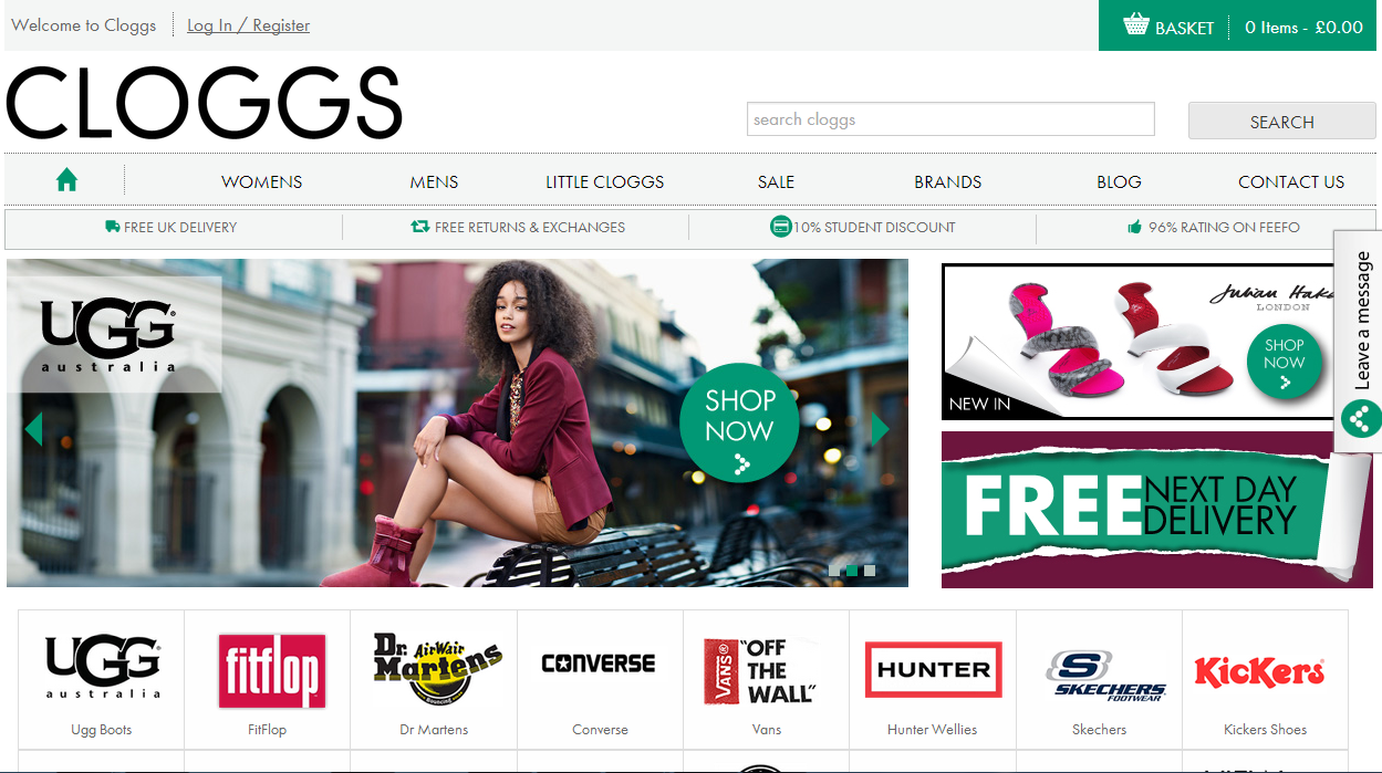
Cloggs.com, which sells women’s clothing and apparel, features a neat design on its desktop version. However, the mobile version takes the cake, with a magnifier and cart incorporated into a small section of the header. The cart experience is smooth and fast, as well.
19) Kershaw.kaiusaltd.com
Selling knives online, Kershaw.kaiusaltd.com sports a unique design in which the front-page banner does not scroll up. Rather, the lower portion of the website takes its place, which is quite cool to look at. Browsing is extremely quick, and the product illustrations are crisp and neat. Mobile viewing is great, too.
20) Firebox.com
Selling a wide range of “cool” things, Firebox sports two navigation bars to display all categories. The website design seems haphazardly stacked, yet it works in its favor in terms of responsiveness. It lets users change currency to that of their country, which is expected in other websites, as well.
21. Mulberry.com
Extremely swift yet high definition design is the asset of this website. It features a minimalistic and highly responsive scheme, so Mulberry takes the cake in terms of browsing quality. The mobile viewing experience is also great, as expected. Using the cart is fast and easy to do.
Medium Responsiveness
The following are sites of medium level responsiveness. The experience they provide is good, though not top flight.
22) Carters.com
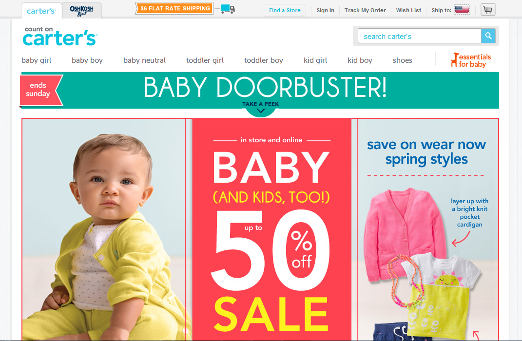
Selling baby apparel, Carters.com also lets you visit Oshkosh.com via the header, but this loads very slowly (and thus loses points for responsiveness). The website otherwise is quite smooth and easy to navigate, and the mobile viewing is likewise decent.
23) Nixon.com
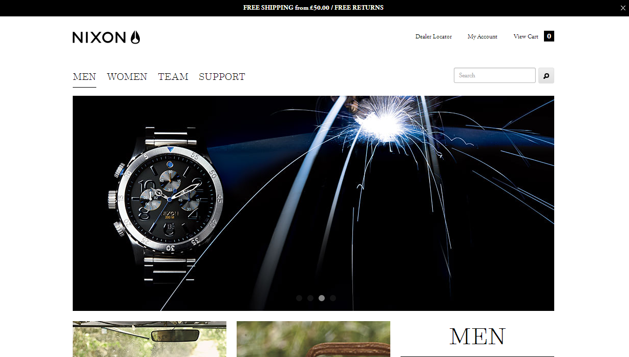
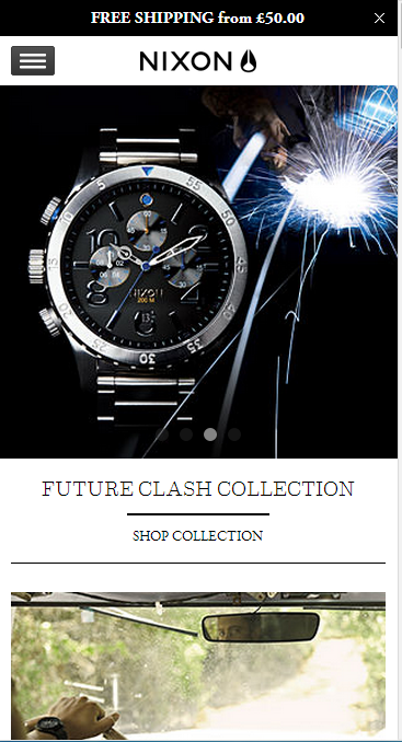
From the looks of it, it seems like a highly responsive website. The front page offers a chicklet design, with the option to enter the male or the female section at first instance. However, it loses out by missing a top navigation column for all its options (watches, headphones, accessories etc.).
24) Indochino
Offering men’s apparel, this website does a fine job as a minimal yet responsive website. However, some of the front-page banners are slow to load, even over a high-speed connection. Nevertheless, navigation in general is fast enough, and the cart experience is smooth and easy.
25) InvitationBox.com
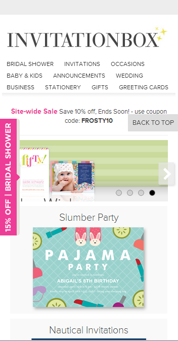
InvitationBox. Com deals in all sorts of invitations, including printed and handmade versions. It features a unique design—it lists all the categories and many featured products on the front page itself, some of which keep scrolling automatically. Despite a complicated structure and a large number of elements on the pages, it is quite responsive.
26) Paintballonline.com
While the mobile version of this website is quite responsive, the desktop version fails to stand out. It features a fairly complex structure, and the top navigation bar looks a little too cramped. Nevertheless, the shopping experience is smooth, and overall the website is responsive.
27) MilesKimball.com
Despite a slightly overcrowded design on the desktop version, this website still stands out as responsive. The top navigation column rolls down sub-categories beneath categories in a slow, smooth drop-down fashion, which might come across as annoying. However, it identifies the categories at both the top and bottom of the page, including all other important links. Thus, it is easy to surf the site. The mobile experience is average.
28) TylerTools.com
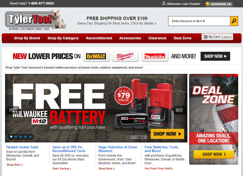
Dealing in mostly hardware tools, this website has a clean interface designed in CSS and Java, with clear, illustrative product pictures. A useless “Bookmarks” add-on in the header could have been utilized better. The mobile and shopping experience is okay, yet nothing to write home about.
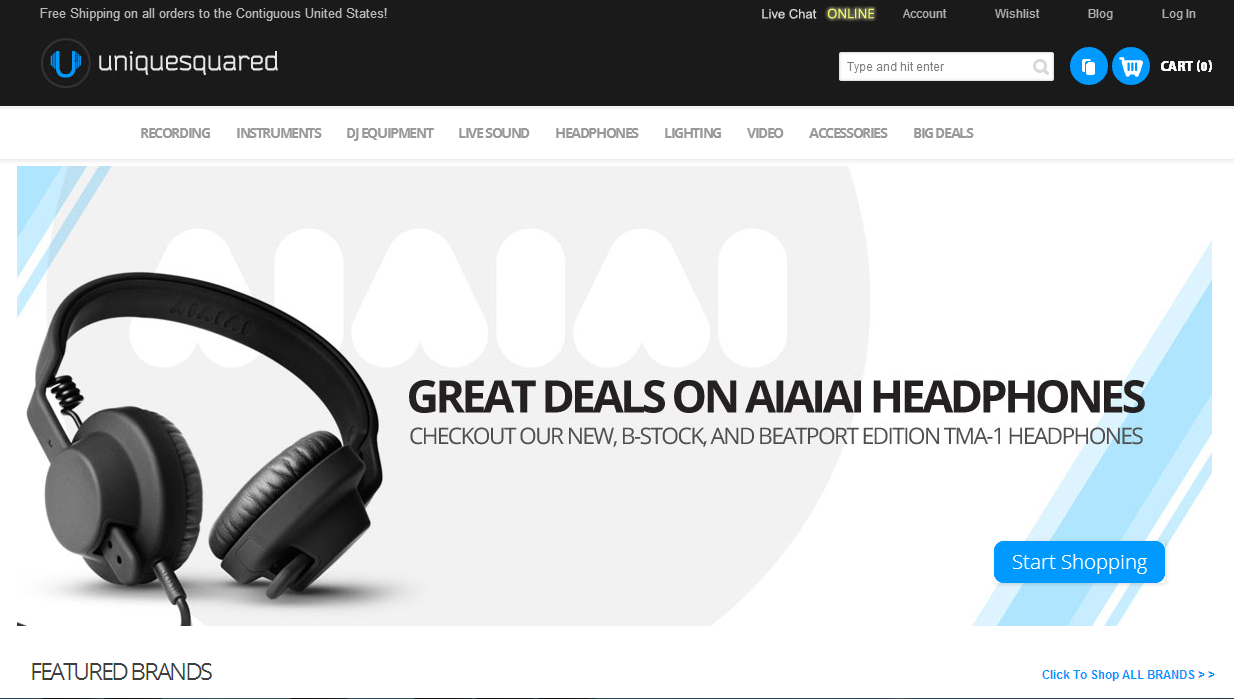
29) UniqueSquared.com
UniqueSquared.com sells music products online. Its website is intelligently designed for desktops. Smooth navigation, clean interface, and high definition (yet quick-loading) pictures are a few of the highs. However, the mobile website stands in stark contrast; its non-contracting pictures indicate that it isn’t built for mobile responsiveness.
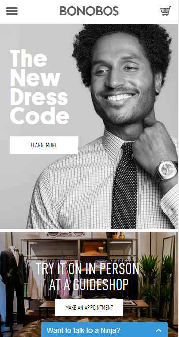
30) Bonobos.com
The great thing about this website is that it’s minimalistic on the front page, yet it leaves out no details in the subpages. It is extremely easy to navigate, and it features a store locator and appointment fixing option on the front page, which make it a responsive website.
31) WetSeal.com
The browsing experience on WetSeal is responsive. Although the intentionally catchy color scheme isn’t pleasant, the responsive drop-down menus and placement of the cart, the delivery checker, and sale offers appearing on the front page make it easy to navigate. However, the shopping experience is not very smooth, as the “Add To Bag” button stops functioning while the page loads.
32) Everythingfurniture.com
This website sports a minimalistic yet responsive design, and features various types of furniture for sale. The structure is good, earning it responsiveness points. Browsing and shopping are nothing to complain about. Overall for what the website wishes to display, it is fairly responsive.
Average to Low Responsiveness
The sites listed below are less responsive. Their design and experience are usually average or below average.
33) EckoUnltd.com
Although the website design is not great, in terms of responsiveness it just about does its job. A social media button integrated into the front banner gives it a crowded look and hampers easy navigation. Cart and mobile experience are nothing to complain about; however, we expect mobile users might have a little trouble using this site.
34) Aswechange.com
A women’s clothing retailer, this website has a complicated structure that makes navigation glitchy, even over a high-speed connection. The front-page rotating banner moves slowly. However, the rest of the website operates smoothly enough. The bright, illustrative product pictures work in its favor.
35. Skymall.com
Skymall.com is a large online shopping website, so it naturally has a complicated structure. However, all options are available right on the front page. However, its color scheme isn’t appealing, and the scrolling navigation menus have a lag time of 1 to 2 seconds. On the other hand, the mobile experience is decent.
Conclusion
The above catalogue of assorted responsive web designs should demonstrate that, when it comes to responsiveness, especially for e-commerce websites, fast and glitch-free browsing, easy mobile viewing and features that increase website usability are much more important than a great looking design. If your website looks great on a desktop but fails to function properly on mobile devices, you’ll lose out on a chunk of your potential market. A large section of desktop surfers now use mobile devices substantially more since the introduction of 3G/4G Internet.
Some websites feature fantastic applications for ease of access and improved usability. These include store locators using map devices, illustrative 360-degree product views, easy checkout buttons, and more, which add great amount of responsiveness to the website design.
Additionally, minimalistic designs seem to be more responsive, due to their ease of access (and fewer components on a page). However, if you have a website on which you must display numerous components, it helps to space them out evenly or use suitable color schemes. These, along with quick loading of elements, make your site much more responsive for visitors.
Another factor in responsive web design is the “visitor friendliness quotient.” For instance, certain websites clearly display the option to log in, subscribe, or bookmark the page. Depending on the type of website, these can really help you retain organic traffic through responsiveness.
Of course, it is a challenge to make the shopping process easy, fast, and secure on mobile devices. However, most of the websites mentioned above seemed to get past this task with ease, and that shows why mobile functionality is one of the essential features of any responsive e-commerce website.
Fonte: http://www.optimonk.com/blog/responsive-ecommerce-sites/


