Having trouble fitting your tables into a responsive site?
They look great on a desktop layout, but look miserable on mobile.
The Basics
First remove any fixed widths from your markup.
Before:
|
1 2 3 4 5 6 7 8 |
<table width="540"> <tr> <td width="300">Header 1</td> <td width="60">Header 2</td> <td>Header 3</td> <td>Header 4</td> </tr> </table> |
After:
|
1 2 3 4 5 6 7 8 |
<table> <tr> <td>Header 1</td> <td>Header 2</td> <td>Header 3</td> <td>Header 4</td> </tr> </table> |
The width attribute is deprecated – better to let the browser size the columns. If you don’t know much about tables, have a read through this massive guide to tables at css tricks.
Basic Styling
First some padding and borders.
|
1 2 3 4 5 6 7 8 9 |
table { border-collapse: collapse; border-spacing: 0; border: 1px solid #bbb; } td,th { border-top: 1px solid #ddd; padding: 4px 8px; } |
Then some striped rows (nth-child is not supported by IE8).
|
1 |
tbody tr:nth-child(even) td { background-color: #eee; } |
Mobile-Friendly Table
As the viewport gets smaller, the table width will shrink. However depending on how many columns you have the table which reach a minimum size. This will probably wider than a mobile viewport, and your layout will be broken.
You could allow the table to horizontal scroll, without breaking your layout. First we have to change the display: to block; and set overflow-x: toauto; – You may want to use a media query to only do this for small devices.
Note: It’s better syntax to wrap the table in a DIV that has overflow-x: scroll;
|
1 2 3 4 5 6 |
@media screen and (max-width: 640px) { table { overflow-x: auto; display: block; } } |
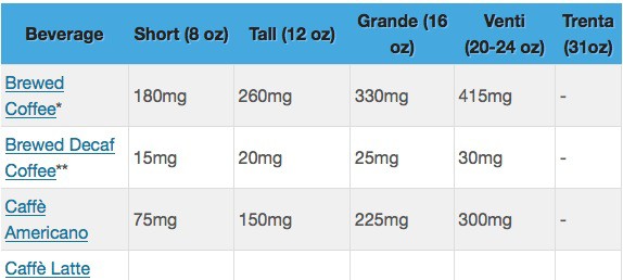
And here’s what we get (this is the amount of caffeine in Starbucks coffee via my site Caffeine Informer). Note that if you have a table that has only a few columns, display: block means they will not resize fit across the full width of the table (if the table is set to 100% width).
DESKTOP
| Beverage | Short (8 oz) | Tall (12 oz) | Grande(16 oz) | Venti (20-24 oz) | Trenta(31oz) |
|---|---|---|---|---|---|
| Brewed Coffee | 180mg | 260mg | 330mg | 415mg | – |
| Brewed Decaf Coffee | 15mg | 20mg | 25mg | 30mg | – |
| Caffè Americano | 75mg | 150mg | 225mg | 300mg | – |
MOBILE (scroll to the right)
This is what happens in mobile (320px wide). The user can swipe right and left to horizontal scroll the table.
The trouble is, the user has no indication that they can swipe to the right.
| Beverage | Short(8 oz) | Tall(12 oz) | Grande(16 oz) | Venti(20-24 oz) | Trenta(31oz) |
|---|---|---|---|---|---|
| Brewed Coffee | 180mg | 260mg | 330mg | 415mg | – |
| Brewed Decaf Coffee | 15mg | 20mg | 25mg | 30mg | – |
| Caffè Americano | 75mg | 150mg | 225mg | 300mg | – |
ALTERNATIVE MOBILE LAYOUT
If you resize this page (or you are viewing it on a mobile device), you will notice a third layout where the columns have been translated into a single column.
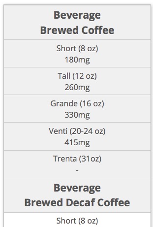
Here, I’ve combined the table cell data with its column header.
Now to other much more powerful options…
1. Footable – jQuery
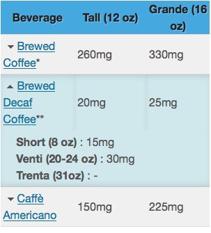
This excellent plugin allows will hide columns of your choosing. When the row is clicked (or tapped) the columns will fold out below the row.
I’ve used an early version of this on Caffeine Informer, and it works well. More recent versions have substantially more features added.
- Give your tables the appropriate data attributes (which columns should be hidden by default).
- Ensure the breakpoints are correct (default 480px and 1024px).
- Call the footable() function for the appropriate tables.
Github: github.com/bradvin/FooTable
Demo and Docs: fooplugins.com/footable-demos
2. Foundation Zurb – Lock first column

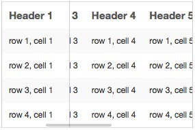
The solution from the Zurb framework is to lock or pin the first column and make the rest of the table scrollable.
To accomplish this they use a small piece of jQuery to manipulate the DOM, and some CSS.
Demo: zurb.com/playground/projects/responsive-tables/index.html
Also see an interesting tutorial on how to add visual cue when the table is going to scroll: design4lifeblog.com/responsive-tables/ — site seems to have disappeared – James.
3. Stacktable

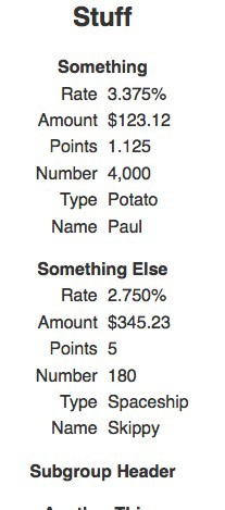
This piece of jQuery will take a table and turn it into one long column of data.
Demo: johnpolacek.github.io/stacktable.js/
Github: github.com/johnpolacek/stacktable.js
4. Responsive Tables

This rather intriguing jQuery script will scale font size of the table according to data attributes.
In the above example, the table tag contains two attributes data-max="30"and data-min="11" indicating a minimum and maximum pixel font size.
Github: github.com/ghepting/jquery-responsive-tables
Demo: garyhepting.com/jquery-responsive-tables/
5. Filament Group – Tablesaw
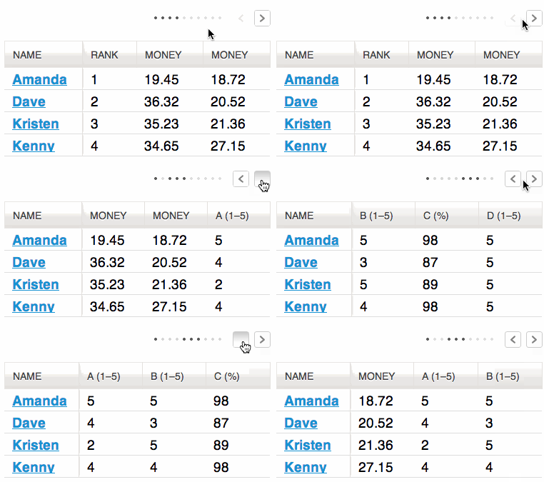
This jQuery solution offers all kinds of different options for table display.
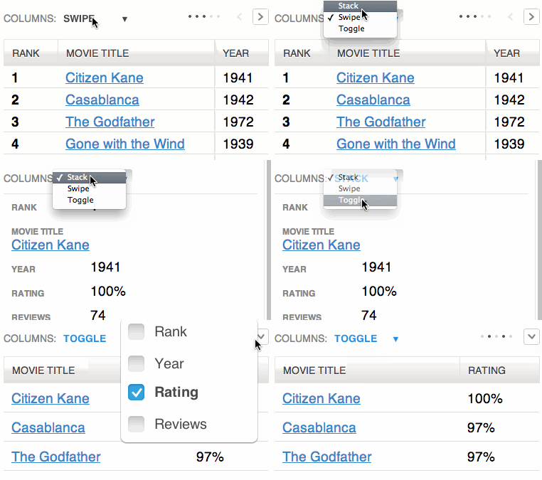
From selectable columns, to swipable columns. As well as prioritizing columns.
There’s a lot of different options in their github repository. This is truly the kitchen sink of responsive tables.
Github: https://github.com/filamentgroup/tablesaw
6. TablePress – WordPress

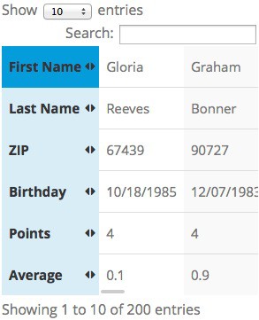
TablePress is a WordPress plugin that utilizes the powerful Datatables jQuery plugin. Datatables is one of the most feature-rich plugins for tables (sorting, filtering, paging, etc).
TablePress has a responsive extension which turns the table on its side, locking the header column in place. Datatables.js is very powerful, but does add considerably to page weight.
TablePress Demo: tablepress.org/demo/
Responsive Extension: tablepress.org/extensions/responsive-tables/
7. ngResponsiveTable

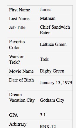
This small jQuery script will turn each row into its own vertical list. Rather than manipulate the DOM (by adding and removing table cells), it puts the header info as a data attribute (data-content) into each td element. The stylesheet then displays this using content: attr(data-content). Quite a clever idea.
Article: netgenlabs.com/Blog/Responsive-Data-Tables-with-ngResponsiveTables-jQuery-plugin
Demo: http://netgen.github.io/jquery.ngResponsiveTables/
8. Codepen by Charlie Cathcart
This clever example uses CSS to accomplish the save as previous but without any JavaScript.
Demo: http://codepen.io/pixelchar/pen/rfuqK
9. Codepen (Dudley Story)
This uses a short (non-jQuery) Javascript to create data attributes into table cells. Then utilizing a CSS media query takes the attributes to format a mobile display.


Nice work.
Demo: http://codepen.io/dudleystorey/pen/Geprd
11. Codepen (Geoff Yuen)
No Javascript, but requires data attributes to be entered into each cell.


More…
- WP Data Tables – A powerful plugin for WordPress that does all kinds of things.
- Flip the table orientation – example code on Codepen.
- Make the headers on slant – Chris Coyier shows how to format tables with really long column headers.
- Responsive Pricing Table – Not about data tables, this tutorial shows how to adapt a pricing table to a mobile viewport.
Fonte: http://exisweb.net/responsive-table-plugins-and-patterns


