There is no longer a debate over whether online retailers need a mobile site, as consumer demand dictates that brands need to optimised for small screens.
However there are still several different options facing brands that want to create a mobile optimised site.
Responsive design is seen by many as being the future of web design, and we previously looked at 11 gorgeous examples of the technology and asked several experts whether site owners need to adopt it.
But the examples we’ve seen suggest that responsive design is currently more popular among design agencies and artists, while major ecommerce retailers have been slow on the uptake.
So to show how responsive design can be applied in retail, here are 10 examples of ecommerce sites built using responsive design…
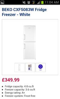
Currys
Currys is quite unusual among the UK’s major retailers for having adopted responsive design.
As a result its site scales perfectly for either screen, without compromising on the user experience.

King of Nothing
Though this site took a while to load properly on my browser it’s a great example of a small retailer using responsive design for an online store.
It’s also quite fun to resize the browser and watch the products shift themselves around the screen on the shop homepage…
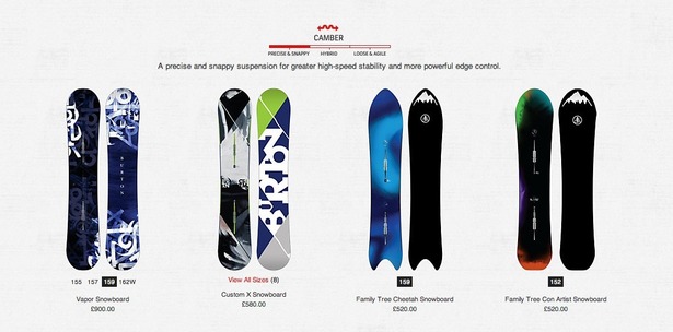
Burton
Snowboard retailer Burton has used responsive design for most of its site, however one aspect that isn’t yet available on mobile is its ‘Board Finder’ tool that asks the customer questions to help them find their perfect snowboard.
United Pixel Workers
This is one of the better examples of this list, as its simple design and use of large calls-to-action means it resizes perfectly on different screen sizes without becoming difficult to use.
One criticism is that hardly any of its products are in stock, but perhaps it’s waiting for a delivery…
![]()
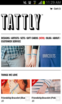
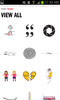
Tattly
Tattly sells temporary tattoos, which is certainly a niche market, yet it has taken the step of embracing responsive design.
It works extremely well in this case as the site uses a lot of white space and also benefits from the great tattoo designs.
Attika
Attika is a German homeware retailer, so I won’t pretend to know how good the copy is on its site.
However it is an excellent example of responsive design and doesn’t seem to suffer from the slow loading times of other sites on this list.
Nuts.com
Another rather niche retailer that is a step ahead of the big players.
Nuts.com isn’t one of the smoothest examples I’ve seen, but is still a good example of how small retailers can use responsive design.

Hiut Denim
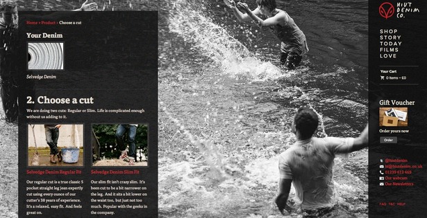
Hiut Denim’s site is a really interesting example, as the desktop site includes attractive background images that disappear entirely on the mobile site.
Despite the imagery the product pages are relatively simple and use large CTAs that translate perfectly onto a mobile screen.
Skinny Ties
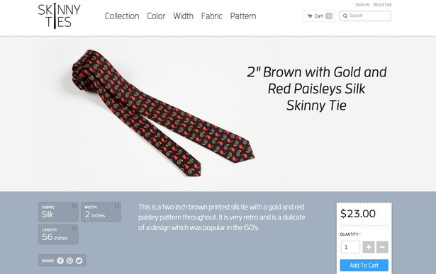
The name of this site gives a fairly good indication of what it sells, and it has created a simple yet attractive storefront that scales perfectly for all screen sizes.
Always Riding
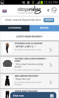
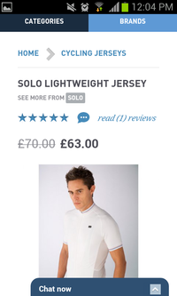
Though there are aspects of this site that I don’t like – such as the fact that it displayed customer reviews in Japanese even though I’m in the UK – it’s another useful example of a small retailer using responsive design.
I’m not convinced that showing rider reviews at the top of the mobile screen is the best use of space, but it’s still easy to navigate regardless of the device you’re using.
Fonte: https://econsultancy.com/blog/61824-10-brilliant-examples-of-responsive-design-in-ecommerce/


